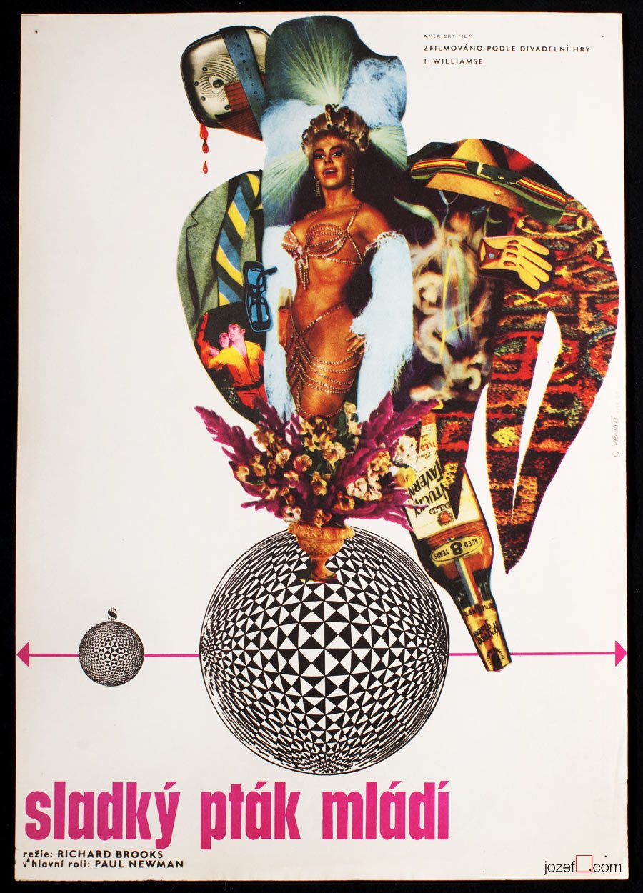
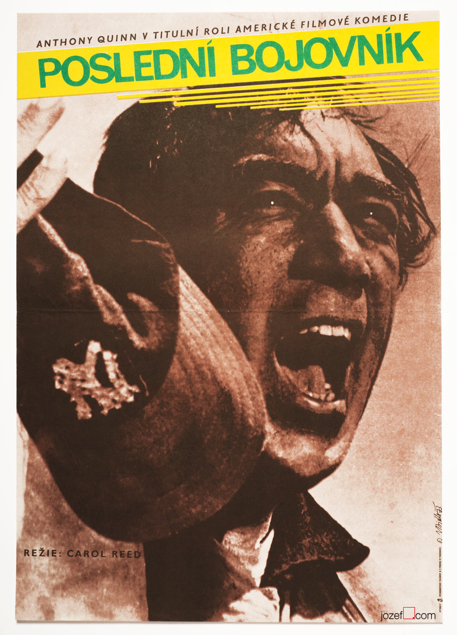
Sweet Bird of Youth movie poster by Vladimír Bidlo, 1962.
19th of October 1926, Kouřim, Czech Republic
1997, Prague, Czech Republic
Education:
1945−1950, State Graphic School, Prague
1945−1950, Charles University, Prague (Faculty of Pedagogy / Art?)
1945−1950, Academy of Arts, Architecture and Design in Prague (prof. F. Tichý)
***
Sixties poster design brought in many interesting artists coming also from other art disciplines. Czech illustrator, graphic and poster artist Vladimír Bidlo is certainly one of them. His adventurous repertoire of film posters starts somewhere in the beginning of 1960s and extends to the mid 1970s. Vladimír Bidlo’s film posters are proving his incredible talent for drawing and illustration (The Appaloosa, below). He also falls for photography and mix the two delicately as can be seen on his earlier film posters.
***
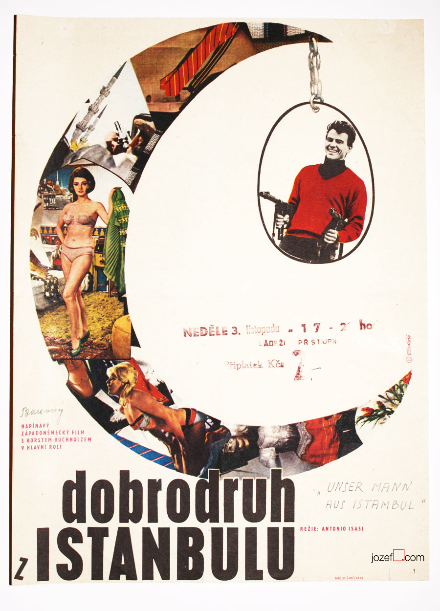
That Man in Istanbul movie poster by Vladimír Bidlo, 1967.
Viva Maria movie poster by Vladimír Bidlo, 1967.
The Firemen’s Ball movie poster by Vladimír Bidlo, 1967/1988.
The Appaloosa movie poster by Vladimír Bidlo, 1970.
***
We believe poster design for Miloš Forman’s The Firemen’s Ball had to resonate together with the film on its premiere in Cannes 1968, poster depicts the film perfectly. Too controversial for the Communists, film was banned and reappeared again by the end of the 1980s, same for the poster. Film posters created for majority of banned films were designed by the most appealing artists of the time. It is hard to tell if designing of film posters for censored movies had any effect on their future art profession. Vladimír Bidlo’s main focus laid on book illustration and after producing several dozens of excellent film posters he fully returned to that.
***
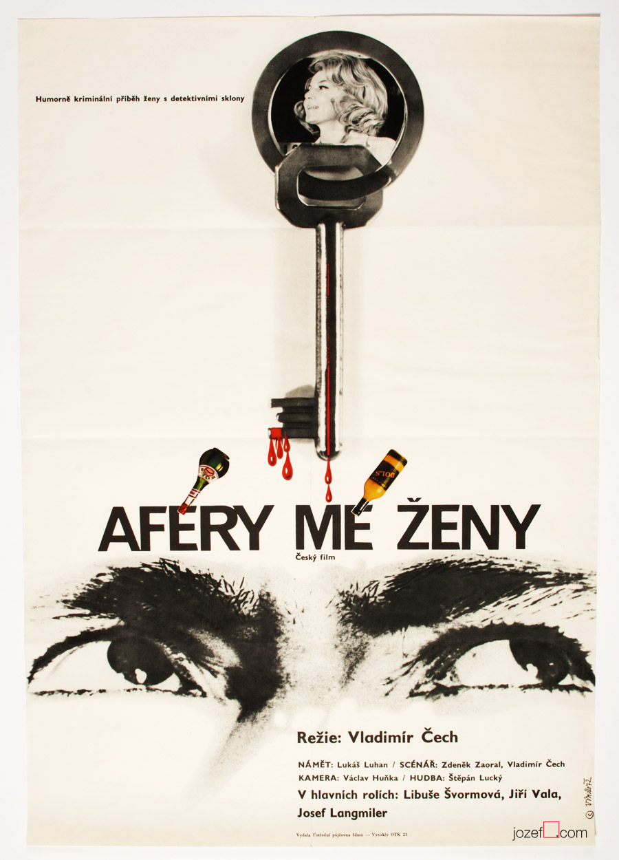
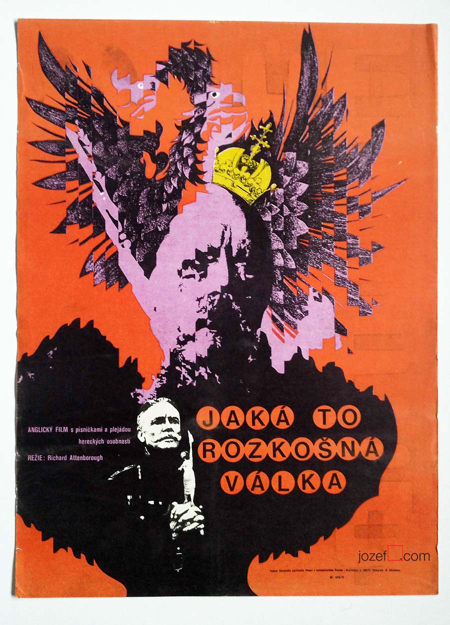
My Wife’s Affair movie poster by Vladimír Bidlo, 1972.
Art Editor / Book Illustration / Graphic Art / Typography
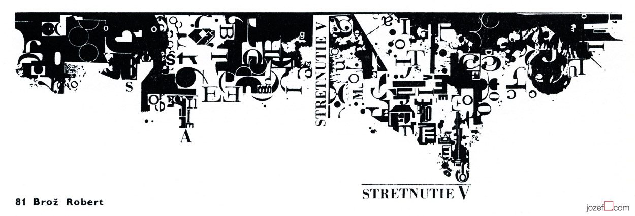
Book cover design, colour letterpress, Robert Brož, 1970 *
***
– b. 10th of August 1939, Prague-Čelákovice, Czech Republic
Education:
– 1954−1958, School of Industrial Art, Bratislava
Exhibitions:
– Biennale Brno 1966, 1970 and later
– Bratislava, Prague, Sofia, 1968
– BIB, Biennale of Book Illustration, Bratislava 1969, 1971 and later
– IBA Leipzig, 1971
– Biennale Warsaw 1971, 1975
– Barcelona, Berlin 1973
Awards:
– Diploma, International exhibition of young poster designers, Sofia, 1968
– Merit Award, IBA Leipzig, 1971
– Merit Award, The most beautiful book of the Year, Bratislava, 1972 and 1977
***
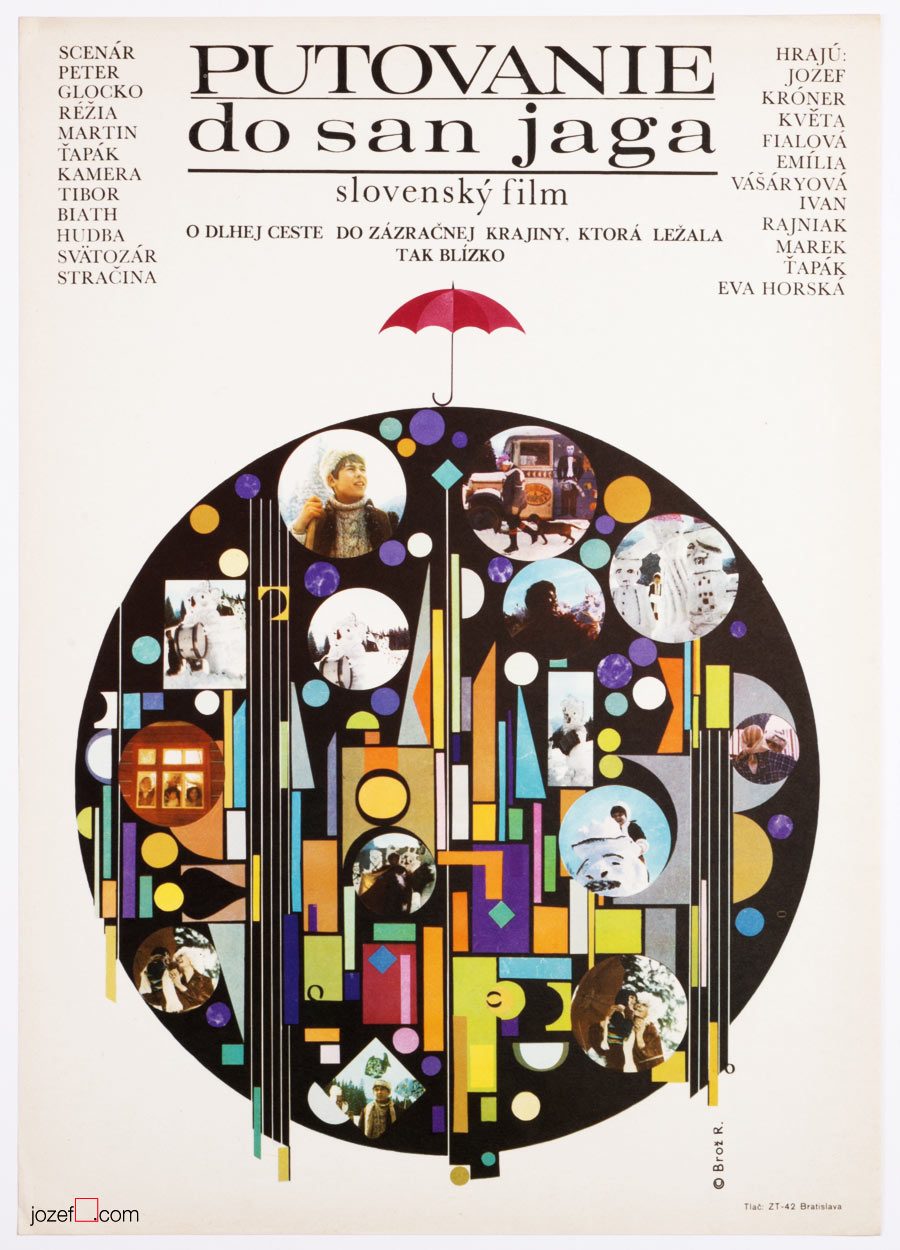
Excellent typography – Pilgrimage to San Jago, Robert Brož, 1973.
***
Robert Brož’s appearance in Czechoslovak film poster archive is rather rarity, even though designing posters was one of his main profession. As a typographer and graphic designer he has created numerous number of book covers (Bronze Medal, IBA Lepzig, 1971), posters and specialised in creating ex libris for collectors. He was also editor and graphic designer of Slovak publishing house Osveta.
We only know of one single film poster Robert Brož has ever designed. It was created for children’s tale Pilgrimage to San Jago (unofficial title) and done very much in what you would call Brussel style. Common design resonating pretty much in everything made in late Sixties Czechoslovakia (precious times swept away by shady 1970’s propaganda).
***
Bratislava City Gallery / Galéria Mesta Bratislavy, logo design, Robert Brož, 1971.**
***
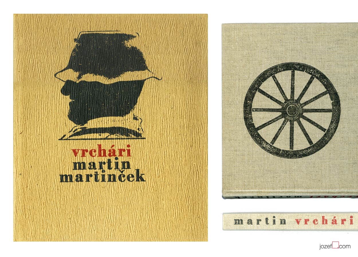
Finding out Robert Brož’s name on majority of books published for Slovak photographer Martin Martinček made us nicely surprised. Martin Martinček’s photography is hugely admired by us and we thought you might like to see more examples of Robert Brož’s design. As he was not exactly movie poster designer, we still believe in his importance in Czechoslovak graphic art and are adding his name to our Sixties designers list.
***
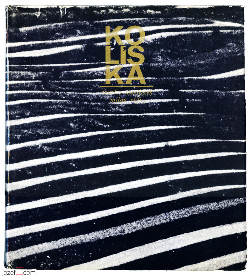
Martin Martinček / Cradle – photography book cover, Robert Brož, 1972.***
***
We will be coming back to Martin Martinček in later individual posts on photography, where we’ll try to show a glimpse of his excellent work and maybe we’ll even reveal some of his unseen prints from our collection of photographs.
***
Martin Martinček / Highlanders – photography book design, Robert Brož, 1975.****
***
Note: this showcase is part of our ongoing article Film posters / Made in Czechoslovakia. The story of film posters.
***
Resources:
Literature:
II. Bienále Užité Grafiky Brno ’66, Medzinárodní Výstava Knižní Grafiky a Ilustrace, Moravská Galerie v Brně. / 2nd Biennale of Graphic Design Brno ’66, The International Exhibition of Book Graphics and Illustrations, Moravian Gallery Brno, 1966
IV. Bienále Užité Grafiky Brno 1970, Medzinárodní Přehlídka Plakátu a Propagační Grafiky, Moravská Galerie v Brně. / 4th Biennale of Graphic Design Brno 1970, The International Exhibition of Poster and Promotional Graphics, Moravian Gallery Brno, 1970
V. Bienále Užité Grafiky Brno 1972, Medzinárodní Výstava Ilustrace a Knižní Grafiky, Moravská Galerie v Brně. / 5th Biennale of Graphic Design Brno 1972, The International Exhibition of Illustrations and Book Graphics, Moravian Gallery Brno, 1972
VII. Bienále Užité Grafiky Brno 1976, Mezinárodní výstava ilustrace a knižní grafiky, Moravská Galerie v Brně. / 7th Biennale of Graphic Design Brno 1976, The International Exhibition of Illustrations and Book Graphics, Moravian Gallery Brno, 1976
IX. Bienále Užité Grafiky Brno 1980, Medzinárodní Výstava Ilustrace a Knižní Grafiky, Moravská Galerie v Brně. / 9th Biennale of Graphic Design 1980, The International Exhibition of Illustrations and Book Graphics, Moravian Gallery Brno, 1980
* Collective authors: Stretnutie / Meetings, Martin 1970. Book cover, colour letterpress. V. Bienále Užité Grafiky Brno 1972, Medzinárodní Výstava Ilustrace a Knižní Grafiky, Moravská Galerie v Brně. / 5th Biennale of Graphic Design Brno 1972, The International Exhibition of Illustrations and Book Graphics, Moravian Gallery Brno, 1972 (p.55)
** logo – Martin Martinček – Exhibition Catalogue, Hora a horské bystriny / Mountain and mountain stream (unofficial translation). Galéria Mesta Bratislavy / Bratislava City Gallery, 1971
*** book cover – Martin Martinček – Milan Rúfus, Kolíska / Cradle (unofficial translation). Osveta, Banská Bystrica, 1972.
**** book cover, book design – Martin Martinček, Vrchári / Highlanders (unofficial translation). Osveta, Martin, 1975
***
For shop and blog highlights, please SUBSCRIBE to our newsletter.
[quote]”It may sound slightly disrespectful, but I am aware that I have a huge wide inventiveness and it makes and justifies me to take interest in many sectors of the art form.” 3[/quote]
We are somewhere in mid fifties, in times of the most absurd terror upon democracy, constant greyness (Stalin’s monument in Prague and similar monsters are being raised across the Czechoslovakia) and bleak vision of existence. At the Academy of Fine Art in Prague the group of three interesting characters are meeting up. In the following words we will try to get closer to one of them.
[quote]”I started out as no one in that field and I was getting jobs for pretty inconsequential films from Romania, Bulgaria and Russia. They were productions of a third or second category. Because of the impressive quality of my work, film poster committee and ÚPF representatives (Formal state film distribution 1957 – 1991) were constantly adding to a momentum. It was reflected in good quality commissions for example for Fellini’s or Visconti’s magnum opus. I had to earn it.” 4[/quote]
Bedřich Dlouhý was not such a tyro/novice at the beginning of his poster designing career as he explains in the quote above. By the time he started to design movie posters (1962) his portfolio contained already good body of art work, some important exhibitions and possibly something extra to it. To his future colleagues he must have been known as someone incredibly talented, the man without hesitation and very likely also without compromise.
•••
The Fall of Berlin movie poster by Bedřich Dlouhý, 1968.
•••
Neglecting the art
Among Bedřich Dlouhý’s best early pieces was exhibiting with art group Šmídrové. Their first exhibition in 1954 called Malmuzherziáda (varieté of painting, music and act as we understand) was made in the hardest times of Stalinist propaganda and Social Realism. Jan Koblasa (Czech artist and the member of the group) in the documentary made for Czech Television demonstrates the climate of late fifties as “very dark and grey”. Days in art school, as days among communist collaborators (“recommended working class was gaining high school diplomas to get legal access to Universities). Loneliness among them was unbearable.” 5 No wonder that the three of them had met under such a circumstances. The group itself had very playful character with Neo Dadaist expression, hockey team and brass band.(Traditional folk music was not in favour of communist propaganda either, they had their own songs full of ridiculous slogans.)
[quote]“We loathed to look as an artists. We loathed to do things as an artists. We played hockey as part of our manifest Šmídrové. It may sound unbelievable, but the main thing was not to be an artist.” 6[/quote]
After their first collaborative exhibition the group was officially established. Show or rather happening in 1957 called “Exhibition for one day” brought in too much controversy. Event had to be cancelled in duration, but it took place elsewhere the following day. On the day one Václav Havel (Czech writer, poet, ex-president) was giving the speech and on the second day he was already taking part with good number of other artists and musicians. Bedřich Dlouhý’s discharge from the Academy followed and lasted for a while.
Poster days and …
As for the film poster Bedřich Dlouhý was testing the new medium so intensely as anything else. His posters might appear visually settled and designed in quite minimalist style. In our examples even his typography might look very basic. Less is more, but not for Bedřich Dlouhý’s movie posters. They are full of hidden symbols and impressions even when they seem so simple.
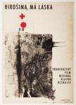
Please come closer and let’s take a look at his The Fall of Berlin movie poster for instance. Fairly suggestive photograph of burning German capital is taking over the larger part of the poster. Pure catastrophe straight into ones face and quite rightly in monochrome. Message is very simple, anyone could guess what the movie poster offers. Bedřich Dlouhý does not want you to only see the movie but he also wants you to use the rest of your senses.
He takes your attention a bit further by exploring the large circle in the middle of the rich red bottom half of the poster. Red colour could represent the tons of blood and it is possibly also used to say big STOP. Almost like the red colour on traffic light advising one to stop, only the circle here is empty. Negating reality and pointing out that people will never learn. Or take the circle together with rectangularly shaped photograph. Two objects want to look little something like exclamation mark and set the message to following? STOP THIS! ? Similarly to the inner part of the circle that tells how it could all end up if we do not stop the wars. His movie poster for Hiroshima Mon Amour was designed in absolutely different style, but the poster also suggests close catastrophe.
•••
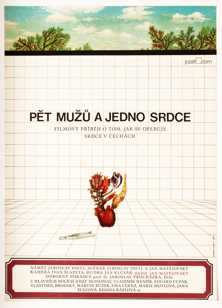
Five Men and One Heart movie poster by Bedřich Dlouhý, 1971.
•••
There are not only serious movie posters author has designed, he does not omit humour and irony (posters designed for The Pink Panther / Blake Edwards in 1966 or In the Woods / Akira Kurosawa in 1970 ) 8 when necessary. He does not use any particular style either, but instead he approaches each individual poster very differently. The one connecting link we have found is that Bedřich Dlouhý’s curiosity does not like to leave things as they are. He wants to get right into to the core of his subject by bringing out the deepest details and he starts from there. He slips between the most complicated expressive forms (techniques frequently used in his paintings) 9 to the most simple designs masterly. Visual illusion and yet with fantastically clear almost microscopic explanation.
Even thought Bedřich Dlouhý created some of the most iconic movie posters of the 60s, his unconventional approach to art form did not meet with the official agenda of the following decade. Similarly to many other artists in the beginning of the 70s he was forced to stop exhibiting and discontinued with designing movie posters.
Collective authors: Czech film posters of 20th century / The Moravian Gallery in Brno, Exlibris Prague, 2004.
2. Flashback / Czech and Slovak Film Posters 1959-1989, ed. Libor Gronský, Marek Perůtka, Michal Soukup, Olomouc Museum of Art, 2004. (p.49). 25 movie posters to our knowledge.
Tomáš Vlček: Současný Plakát / Contemporary Poster, Odeon, Prague, 1976.
Československý Plakát / Czechoslovak Poster, exhibition catalogue, Olomouc (Czech Republic), 1967. One of the most important poster exhibition in the history of Czechoslovak poster design. We wish to return back to catalogue and give it a full blog post once we are ready.
Online:
1.abArt / Bedřich Dlouhý / see for the full list of exhibitions. abArt takes always first place and star when it comes to research.
It is fairly interesting when thinking of Rudolf Altrichter’s designs for film posters, that behind all this visual trickery is hidden self-taught artist. Originally trained as a sales man (worked also for Bata / shoemaker company) he became one of the most influential Slovak graphic artist. In his thirties he became one of the establishing members of newly reopen Slovak Art Society (1946) and year later co-founder of Association of Slovak Graphic Artists (1947).
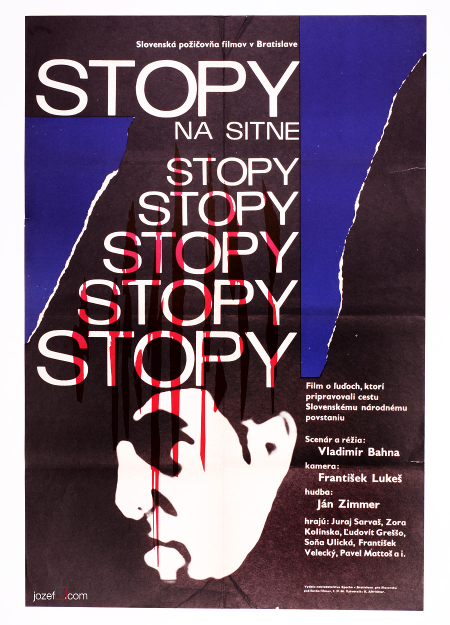
Rudolf Altrichter’s film posters are full of visual harmony, unusually blended by pure abstraction and the hints of reality. Human element appears to be one of his strongest standing point, no matter if it is design for art exhibition, film or political poster. Visual harmony is also represented by the use of elegant thin lines and curvy almost psychedelic shapes. Absurdity of the war, another of his characteristic motifs, can be also seen on several of his film posters. Film poster designed for French drama Dangerous Love Affairs / Dangerous Liaisons (shown bellow, designed in 1969), belongs to the selection of the most significant acquisitions of the Poster and Graphic Design Collection of Slovak National Gallery.
***
Dangerous Love Affairs movie poster by Rudolf Altrichter, 1969.
Talking Caftan movie poster by Rudolf Altrichter, 1969.
Traces on the Sitno movie poster by Rudolf Altrichter, 1968.
What a Lovely War movie poster by Rudolf Altrichter, 1969.
The Upthrown Stone movie poster by Rudolf Altrichter, 1970.
Girl from the Mountains movie poster by Altrichter, 1972.
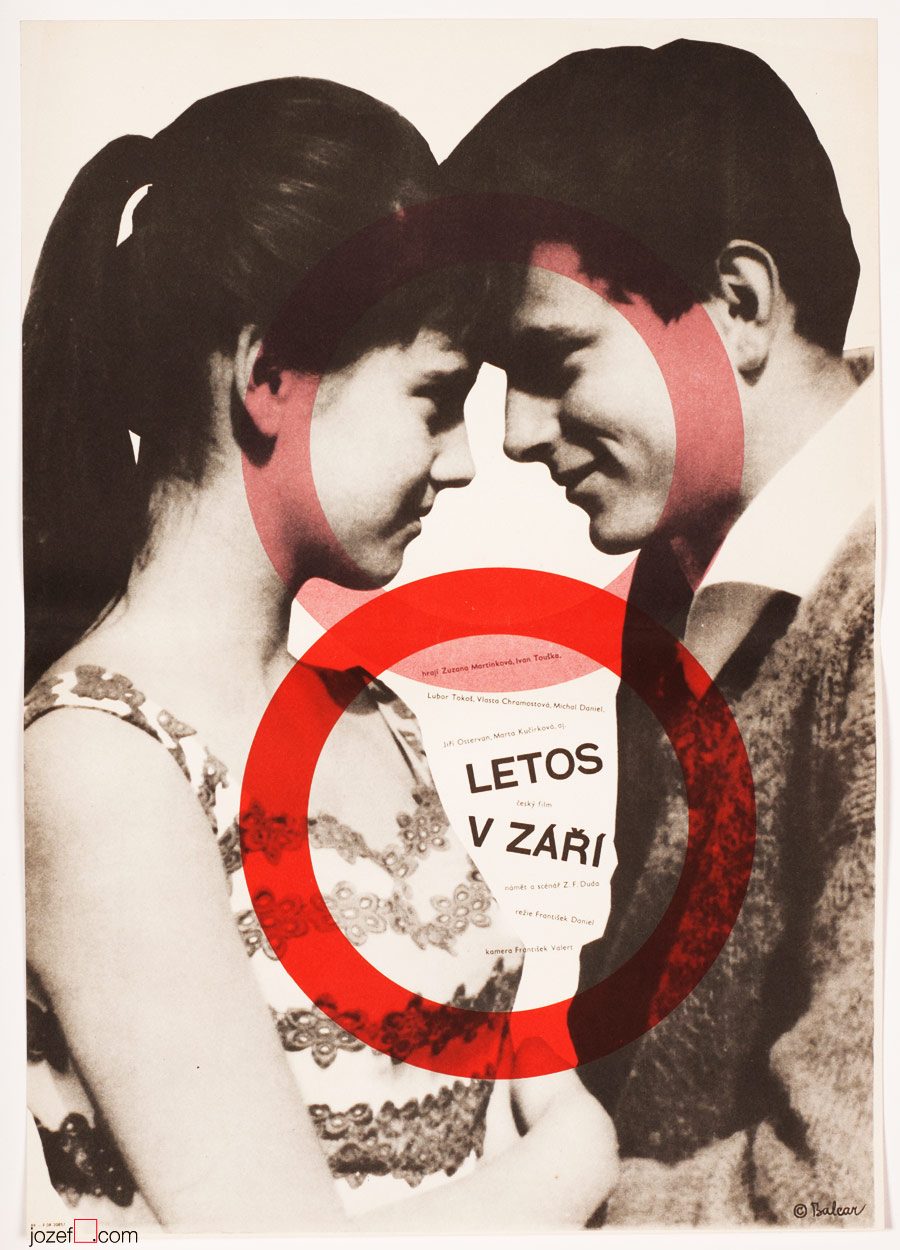
This Year in September movie poster by Jiří Balcar, 1963.
***
Czech artist Jiří Balcar could easily belong to one of the most fascinating poster designers of the Sixties. It’s hard to judge by the small number of his posters in our collection, but his artwork as we are finding out, spreads all across the globe (short list bellow). Internationally started off at Farleigh Dickinson University in Madison (New Jersey) where he took part in International Invitational Seminar of Art, followed by exhibition in New York in 19643 , Berlin (1965-66) and Wien (1966). Paris exhibition in Musée d’Art Moderne (1969) was held soon after his early death in 1968.
A wide spectrum of his artistic experiments are brought in from the painting and are reflected in his poster designs. Extensive use of letter templates, sometimes broken into separate parts, wise and bright selection of colours (unless Monochromatic, or sensible mix of both), unconventional use of photography and perfect understanding of space. His faceless figures, motif reappearing on several of his paintings, could become alive only on the film poster.
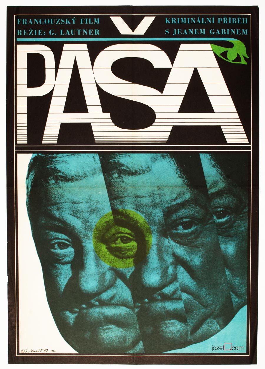
Movie poster shown on the picture above has been seen previously in one of our articles on History of Poster Design in Czechoslovakia. It did not stop us from refreshing the memory as we are strongly effected by its expressiveness. Jean Gabin‘s common impression for every French born was broken into uncertainty. Divided into parallel fields as in the rhythm similar to main theme of that phenomenal soundtrack composed by Serge Gainsbourg. Music moves on as we can see even on the letters, one can hear the most peculiar sounds.
Mysterious poster for Georges Lautner‘s film is hiding one extra mystery and that is the poster designer himself. Jaromír Bradáč remains the one, or at least for now. You can count number of his film posters on your left hand and that’s about everything we could track on this fantastic graphic designer. Hopefully the future will show some more light about him, as we believe five film posters is not everything he did.
***
A Study About Women, film poster by Jaromír Bradáč, 1968.
Art Editor / Book Illustration / Graphic Art / Typography
Book cover design, colour letterpress, Robert Brož, 1970 *
***
– b. 10th of August 1939, Prague-Čelákovice, Czech Republic
Education:
– 1954−1958, School of Industrial Art, Bratislava
Exhibitions:
– Biennale Brno 1966, 1970 and later
– Bratislava, Prague, Sofia, 1968
– BIB, Biennale of Book Illustration, Bratislava 1969, 1971 and later
– IBA Leipzig, 1971
– Biennale Warsaw 1971, 1975
– Barcelona, Berlin 1973
Awards:
– Diploma, International exhibition of young poster designers, Sofia, 1968
– Merit Award, IBA Leipzig, 1971
– Merit Award, The most beautiful book of the Year, Bratislava, 1972 and 1977
***
Excellent typography – Pilgrimage to San Jago, Robert Brož, 1973.
***
Robert Brož’s appearance in Czechoslovak film poster archive is rather rarity, even though designing posters was one of his main profession. As a typographer and graphic designer he has created numerous number of book covers (Bronze Medal, IBA Lepzig, 1971), posters and specialised in creating ex libris for collectors. He was also editor and graphic designer of Slovak publishing house Osveta.
We only know of one single film poster Robert Brož has ever designed. It was created for children’s tale Pilgrimage to San Jago (unofficial title) and done very much in what you would call Brussel style. Common design resonating pretty much in everything made in late Sixties Czechoslovakia (precious times swept away by shady 1970’s propaganda).
***
Bratislava City Gallery / Galéria Mesta Bratislavy, logo design, Robert Brož, 1971.**
***
Finding out Robert Brož’s name on majority of books published for Slovak photographer Martin Martinček made us nicely surprised. Martin Martinček’s photography is hugely admired by us and we thought you might like to see more examples of Robert Brož’s design. As he was not exactly movie poster designer, we still believe in his importance in Czechoslovak graphic art and are adding his name to our Sixties designers list.
***
Martin Martinček / Cradle – photography book cover, Robert Brož, 1972.***
***
We will be coming back to Martin Martinček in later individual posts on photography, where we’ll try to show a glimpse of his excellent work and maybe we’ll even reveal some of his unseen prints from our collection of photographs.
***
Martin Martinček / Highlanders – photography book design, Robert Brož, 1975.****
***
Note: this showcase is part of our ongoing article Film posters / Made in Czechoslovakia. The story of film posters.
***
Resources:
Literature:
II. Bienále Užité Grafiky Brno ’66, Medzinárodní Výstava Knižní Grafiky a Ilustrace, Moravská Galerie v Brně. / 2nd Biennale of Graphic Design Brno ’66, The International Exhibition of Book Graphics and Illustrations, Moravian Gallery Brno, 1966
IV. Bienále Užité Grafiky Brno 1970, Medzinárodní Přehlídka Plakátu a Propagační Grafiky, Moravská Galerie v Brně. / 4th Biennale of Graphic Design Brno 1970, The International Exhibition of Poster and Promotional Graphics, Moravian Gallery Brno, 1970
V. Bienále Užité Grafiky Brno 1972, Medzinárodní Výstava Ilustrace a Knižní Grafiky, Moravská Galerie v Brně. / 5th Biennale of Graphic Design Brno 1972, The International Exhibition of Illustrations and Book Graphics, Moravian Gallery Brno, 1972
VII. Bienále Užité Grafiky Brno 1976, Mezinárodní výstava ilustrace a knižní grafiky, Moravská Galerie v Brně. / 7th Biennale of Graphic Design Brno 1976, The International Exhibition of Illustrations and Book Graphics, Moravian Gallery Brno, 1976
IX. Bienále Užité Grafiky Brno 1980, Medzinárodní Výstava Ilustrace a Knižní Grafiky, Moravská Galerie v Brně. / 9th Biennale of Graphic Design 1980, The International Exhibition of Illustrations and Book Graphics, Moravian Gallery Brno, 1980
* Collective authors: Stretnutie / Meetings, Martin 1970. Book cover, colour letterpress. V. Bienále Užité Grafiky Brno 1972, Medzinárodní Výstava Ilustrace a Knižní Grafiky, Moravská Galerie v Brně. / 5th Biennale of Graphic Design Brno 1972, The International Exhibition of Illustrations and Book Graphics, Moravian Gallery Brno, 1972 (p.55)
** logo – Martin Martinček – Exhibition Catalogue, Hora a horské bystriny / Mountain and mountain stream (unofficial translation). Galéria Mesta Bratislavy / Bratislava City Gallery, 1971
*** book cover – Martin Martinček – Milan Rúfus, Kolíska / Cradle (unofficial translation). Osveta, Banská Bystrica, 1972.
**** book cover, book design – Martin Martinček, Vrchári / Highlanders (unofficial translation). Osveta, Martin, 1975
***
For shop and blog highlights, please SUBSCRIBE to our newsletter.
[quote]”It may sound slightly disrespectful, but I am aware that I have a huge wide inventiveness and it makes and justifies me to take interest in many sectors of the art form.” 3[/quote]
We are somewhere in mid fifties, in times of the most absurd terror upon democracy, constant greyness (Stalin’s monument in Prague and similar monsters are being raised across the Czechoslovakia) and bleak vision of existence. At the Academy of Fine Art in Prague the group of three interesting characters are meeting up. In the following words we will try to get closer to one of them.
[quote]”I started out as no one in that field and I was getting jobs for pretty inconsequential films from Romania, Bulgaria and Russia. They were productions of a third or second category. Because of the impressive quality of my work, film poster committee and ÚPF representatives (Formal state film distribution 1957 – 1991) were constantly adding to a momentum. It was reflected in good quality commissions for example for Fellini’s or Visconti’s magnum opus. I had to earn it.” 4[/quote]
Bedřich Dlouhý was not such a tyro/novice at the beginning of his poster designing career as he explains in the quote above. By the time he started to design movie posters (1962) his portfolio contained already good body of art work, some important exhibitions and possibly something extra to it. To his future colleagues he must have been known as someone incredibly talented, the man without hesitation and very likely also without compromise.
•••
The Fall of Berlin movie poster by Bedřich Dlouhý, 1968.
•••
Neglecting the art
Among Bedřich Dlouhý’s best early pieces was exhibiting with art group Šmídrové. Their first exhibition in 1954 called Malmuzherziáda (varieté of painting, music and act as we understand) was made in the hardest times of Stalinist propaganda and Social Realism. Jan Koblasa (Czech artist and the member of the group) in the documentary made for Czech Television demonstrates the climate of late fifties as “very dark and grey”. Days in art school, as days among communist collaborators (“recommended working class was gaining high school diplomas to get legal access to Universities). Loneliness among them was unbearable.” 5 No wonder that the three of them had met under such a circumstances. The group itself had very playful character with Neo Dadaist expression, hockey team and brass band.(Traditional folk music was not in favour of communist propaganda either, they had their own songs full of ridiculous slogans.)
[quote]“We loathed to look as an artists. We loathed to do things as an artists. We played hockey as part of our manifest Šmídrové. It may sound unbelievable, but the main thing was not to be an artist.” 6[/quote]
After their first collaborative exhibition the group was officially established. Show or rather happening in 1957 called “Exhibition for one day” brought in too much controversy. Event had to be cancelled in duration, but it took place elsewhere the following day. On the day one Václav Havel (Czech writer, poet, ex-president) was giving the speech and on the second day he was already taking part with good number of other artists and musicians. Bedřich Dlouhý’s discharge from the Academy followed and lasted for a while.
Poster days and …
As for the film poster Bedřich Dlouhý was testing the new medium so intensely as anything else. His posters might appear visually settled and designed in quite minimalist style. In our examples even his typography might look very basic. Less is more, but not for Bedřich Dlouhý’s movie posters. They are full of hidden symbols and impressions even when they seem so simple.
Please come closer and let’s take a look at his The Fall of Berlin movie poster for instance. Fairly suggestive photograph of burning German capital is taking over the larger part of the poster. Pure catastrophe straight into ones face and quite rightly in monochrome. Message is very simple, anyone could guess what the movie poster offers. Bedřich Dlouhý does not want you to only see the movie but he also wants you to use the rest of your senses.
He takes your attention a bit further by exploring the large circle in the middle of the rich red bottom half of the poster. Red colour could represent the tons of blood and it is possibly also used to say big STOP. Almost like the red colour on traffic light advising one to stop, only the circle here is empty. Negating reality and pointing out that people will never learn. Or take the circle together with rectangularly shaped photograph. Two objects want to look little something like exclamation mark and set the message to following? STOP THIS! ? Similarly to the inner part of the circle that tells how it could all end up if we do not stop the wars. His movie poster for Hiroshima Mon Amour was designed in absolutely different style, but the poster also suggests close catastrophe.
•••
Five Men and One Heart movie poster by Bedřich Dlouhý, 1971.
•••
There are not only serious movie posters author has designed, he does not omit humour and irony (posters designed for The Pink Panther / Blake Edwards in 1966 or In the Woods / Akira Kurosawa in 1970 ) 8 when necessary. He does not use any particular style either, but instead he approaches each individual poster very differently. The one connecting link we have found is that Bedřich Dlouhý’s curiosity does not like to leave things as they are. He wants to get right into to the core of his subject by bringing out the deepest details and he starts from there. He slips between the most complicated expressive forms (techniques frequently used in his paintings) 9 to the most simple designs masterly. Visual illusion and yet with fantastically clear almost microscopic explanation.
Even thought Bedřich Dlouhý created some of the most iconic movie posters of the 60s, his unconventional approach to art form did not meet with the official agenda of the following decade. Similarly to many other artists in the beginning of the 70s he was forced to stop exhibiting and discontinued with designing movie posters.
Collective authors: Czech film posters of 20th century / The Moravian Gallery in Brno, Exlibris Prague, 2004.
2. Flashback / Czech and Slovak Film Posters 1959-1989, ed. Libor Gronský, Marek Perůtka, Michal Soukup, Olomouc Museum of Art, 2004. (p.49). 25 movie posters to our knowledge.
Tomáš Vlček: Současný Plakát / Contemporary Poster, Odeon, Prague, 1976.
Československý Plakát / Czechoslovak Poster, exhibition catalogue, Olomouc (Czech Republic), 1967. One of the most important poster exhibition in the history of Czechoslovak poster design. We wish to return back to catalogue and give it a full blog post once we are ready.
Online:
1.abArt / Bedřich Dlouhý / see for the full list of exhibitions. abArt takes always first place and star when it comes to research.
It is fairly interesting when thinking of Rudolf Altrichter’s designs for film posters, that behind all this visual trickery is hidden self-taught artist. Originally trained as a sales man (worked also for Bata / shoemaker company) he became one of the most influential Slovak graphic artist. In his thirties he became one of the establishing members of newly reopen Slovak Art Society (1946) and year later co-founder of Association of Slovak Graphic Artists (1947).
Rudolf Altrichter’s film posters are full of visual harmony, unusually blended by pure abstraction and the hints of reality. Human element appears to be one of his strongest standing point, no matter if it is design for art exhibition, film or political poster. Visual harmony is also represented by the use of elegant thin lines and curvy almost psychedelic shapes. Absurdity of the war, another of his characteristic motifs, can be also seen on several of his film posters. Film poster designed for French drama Dangerous Love Affairs / Dangerous Liaisons (shown bellow, designed in 1969), belongs to the selection of the most significant acquisitions of the Poster and Graphic Design Collection of Slovak National Gallery.
***
Dangerous Love Affairs movie poster by Rudolf Altrichter, 1969.
Talking Caftan movie poster by Rudolf Altrichter, 1969.
Traces on the Sitno movie poster by Rudolf Altrichter, 1968.
What a Lovely War movie poster by Rudolf Altrichter, 1969.
The Upthrown Stone movie poster by Rudolf Altrichter, 1970.
Girl from the Mountains movie poster by Altrichter, 1972.
This Year in September movie poster by Jiří Balcar, 1963.
***
Czech artist Jiří Balcar could easily belong to one of the most fascinating poster designers of the Sixties. It’s hard to judge by the small number of his posters in our collection, but his artwork as we are finding out, spreads all across the globe (short list bellow). Internationally started off at Farleigh Dickinson University in Madison (New Jersey) where he took part in International Invitational Seminar of Art, followed by exhibition in New York in 19643 , Berlin (1965-66) and Wien (1966). Paris exhibition in Musée d’Art Moderne (1969) was held soon after his early death in 1968.
A wide spectrum of his artistic experiments are brought in from the painting and are reflected in his poster designs. Extensive use of letter templates, sometimes broken into separate parts, wise and bright selection of colours (unless Monochromatic, or sensible mix of both), unconventional use of photography and perfect understanding of space. His faceless figures, motif reappearing on several of his paintings, could become alive only on the film poster.
Movie poster shown on the picture above has been seen previously in one of our articles on History of Poster Design in Czechoslovakia. It did not stop us from refreshing the memory as we are strongly effected by its expressiveness. Jean Gabin‘s common impression for every French born was broken into uncertainty. Divided into parallel fields as in the rhythm similar to main theme of that phenomenal soundtrack composed by Serge Gainsbourg. Music moves on as we can see even on the letters, one can hear the most peculiar sounds.
Mysterious poster for Georges Lautner‘s film is hiding one extra mystery and that is the poster designer himself. Jaromír Bradáč remains the one, or at least for now. You can count number of his film posters on your left hand and that’s about everything we could track on this fantastic graphic designer. Hopefully the future will show some more light about him, as we believe five film posters is not everything he did.
***
A Study About Women, film poster by Jaromír Bradáč, 1968.