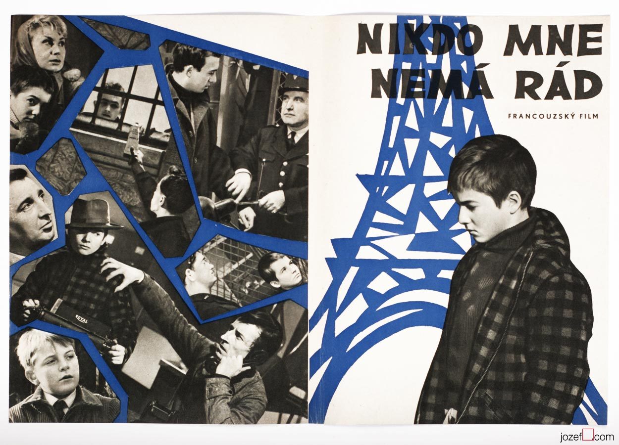
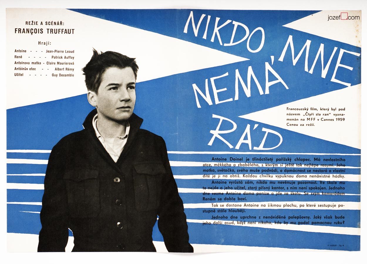
Poster Designs / Sixties – Bedřich Dlouhý. The Story of Film Posters.
Film posters in history. Sixties poster designs.
Poster Designer / Bedřich Dlouhý
Fine Art / Graphic Design / Typography
•••
•••
- b. 2nd August 1932, Plzeň (Pilsen), Czech Republic
Education / Pedagogue:
- 1949 − 1952, Specialised Ceramics school in Prague [^1]
- 1953 − 1959, Academy of Fine Arts, Prague (Karel Souček, Miroslav Hollý)
- 1990 – 1995, taught as professor at Academy of Fine Arts, Prague
Exhibitions / Awards:
- up to 70s artist exhibited mostly in group shows across the Europe and Czechoslovakia
- IV. Biennale de Paris, Musée d’Art Moderne de la Ville de Paris, 1965 (Awarded)
Art Groups:
- Palette of Homeland (unofficial trans.) / Paleta vlasti (Hockey team consisting of several of artist’s friends)
- Šmídrové (from 1954)
- Confrontation / Konfrontace (from 1961, also Jiří Balcar)
- Retarded / Zaostalí (from 1987)
Film posters created: 23 (1962-1971) [^2]
•••
[quote]”It may sound slightly disrespectful, but I am aware that I have a huge wide inventiveness and it makes and justifies me to take interest in many sectors of the art form.” [^3][/quote]
We are somewhere in mid fifties, in times of the most absurd terror upon democracy, constant greyness (Stalin’s monument in Prague and similar monsters are being raised across the Czechoslovakia) and bleak vision of existence. At the Academy of Fine Art in Prague the group of three interesting characters are meeting up. In the following words we will try to get closer to one of them.
[quote]”I started out as no one in that field and I was getting jobs for pretty inconsequential films from Romania, Bulgaria and Russia. They were productions of a third or second category. Because of the impressive quality of my work, film poster committee and ÚPF representatives (Formal state film distribution 1957 – 1991) were constantly adding to a momentum. It was reflected in good quality commissions for example for Fellini’s or Visconti’s magnum opus. I had to earn it.” [^4][/quote]
Bedřich Dlouhý was not such a tyro/novice at the beginning of his poster designing career as he explains in the quote above. By the time he started to design movie posters (1962) his portfolio contained already good body of art work, some important exhibitions and possibly something extra to it. To his future colleagues he must have been known as someone incredibly talented, the man without hesitation and very likely also without compromise.
•••
•••
Neglecting the art
Among Bedřich Dlouhý’s best early pieces was exhibiting with art group Šmídrové. Their first exhibition in 1954 called Malmuzherziáda (varieté of painting, music and act as we understand) was made in the hardest times of Stalinist propaganda and Social Realism. Jan Koblasa (Czech artist and the member of the group) in the documentary made for Czech Television demonstrates the climate of late fifties as “very dark and grey”. Days in art school, as days among communist collaborators (“recommended working class was gaining high school diplomas to get legal access to Universities). Loneliness among them was unbearable.” [^5] No wonder that the three of them had met under such a circumstances. The group itself had very playful character with Neo Dadaist expression, hockey team and brass band.(Traditional folk music was not in favour of communist propaganda either, they had their own songs full of ridiculous slogans.)
[quote]“We loathed to look as an artists. We loathed to do things as an artists. We played hockey as part of our manifest Šmídrové. It may sound unbelievable, but the main thing was not to be an artist.” [^6][/quote]
After their first collaborative exhibition the group was officially established. Show or rather happening in 1957 called “Exhibition for one day” brought in too much controversy. Event had to be cancelled in duration, but it took place elsewhere the following day. On the day one Václav Havel (Czech writer, poet, ex-president) was giving the speech and on the second day he was already taking part with good number of other artists and musicians. Bedřich Dlouhý’s discharge from the Academy followed and lasted for a while.
Poster days and …
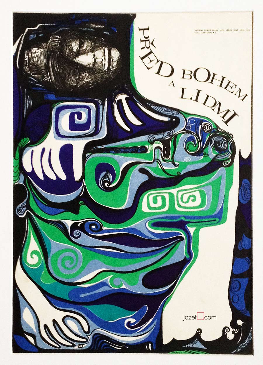
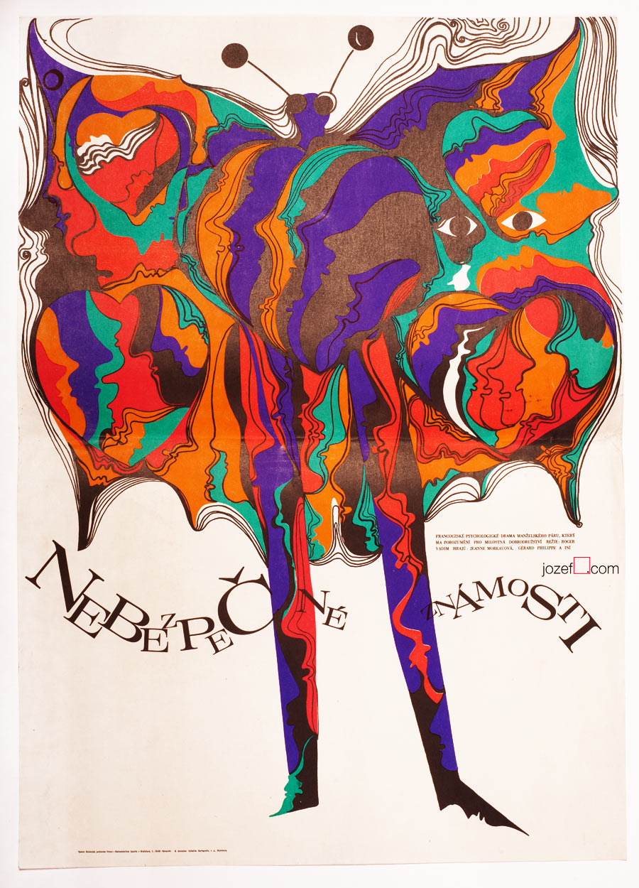
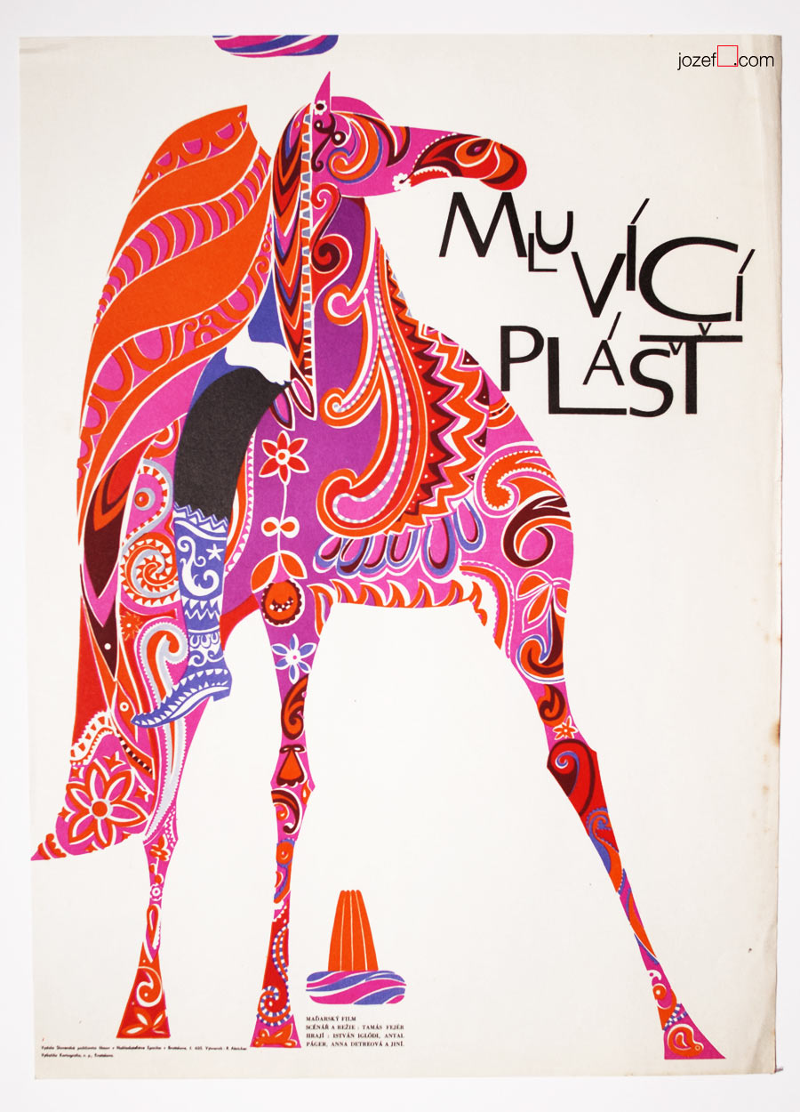
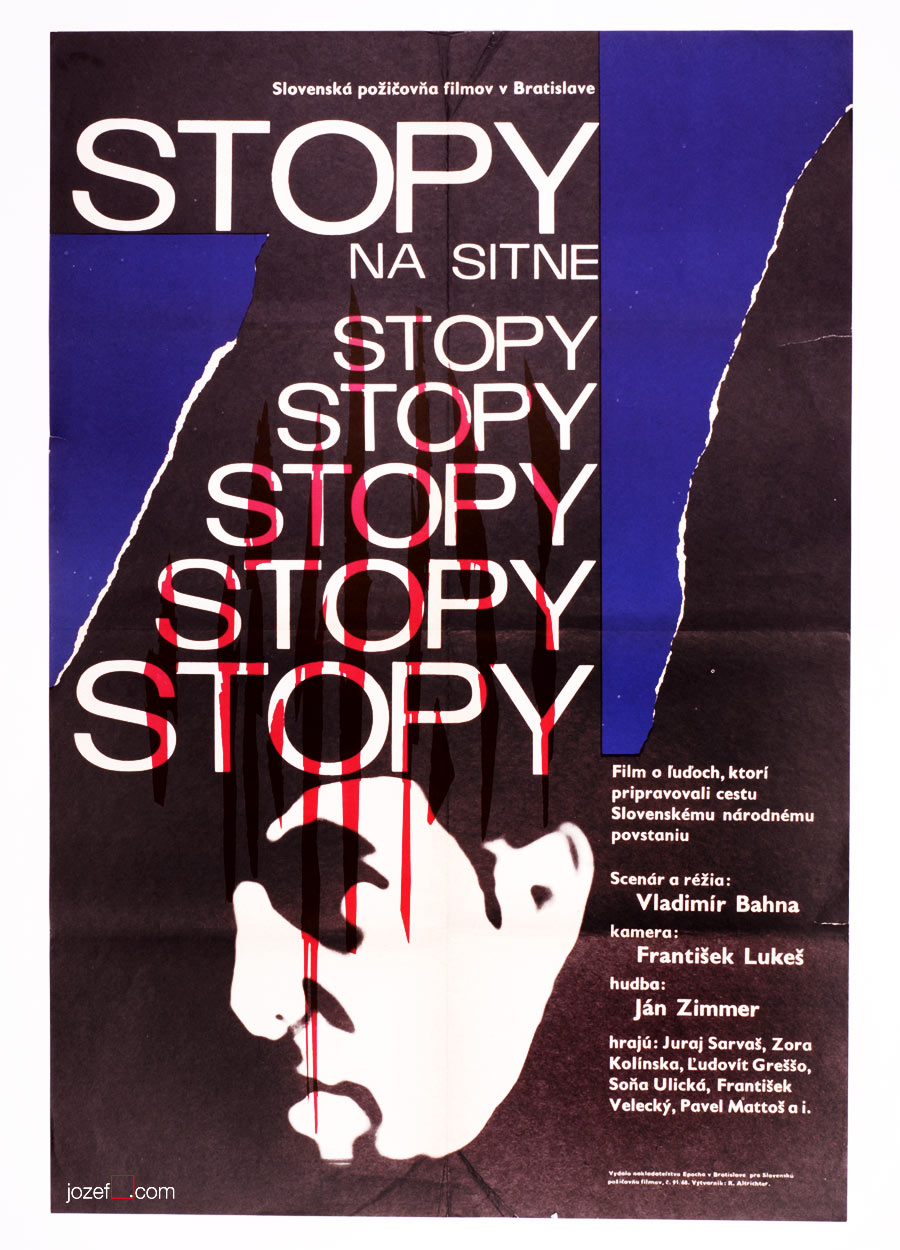
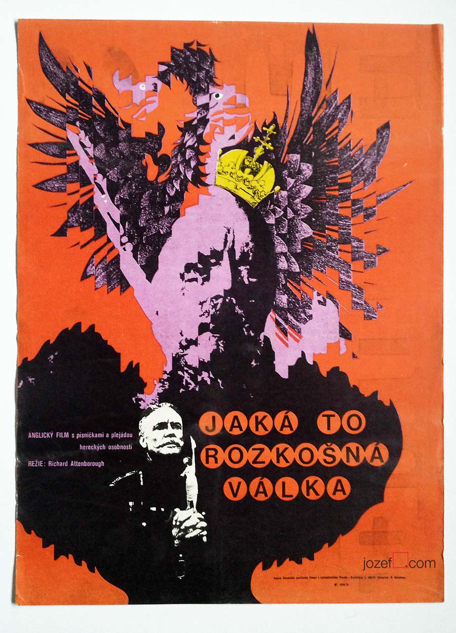
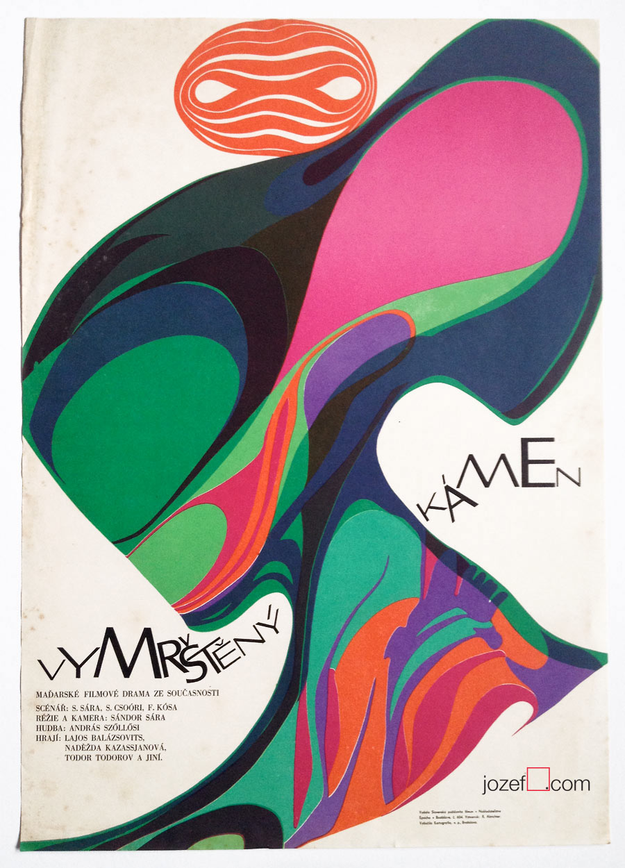
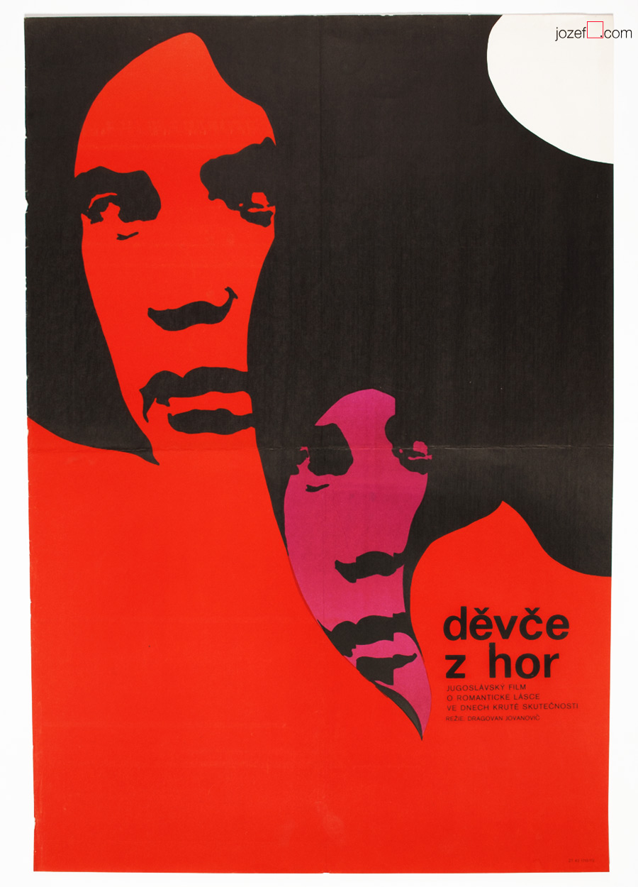
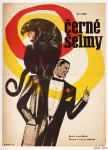
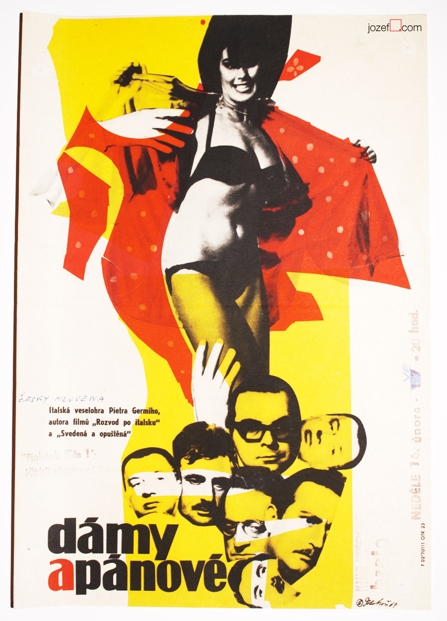
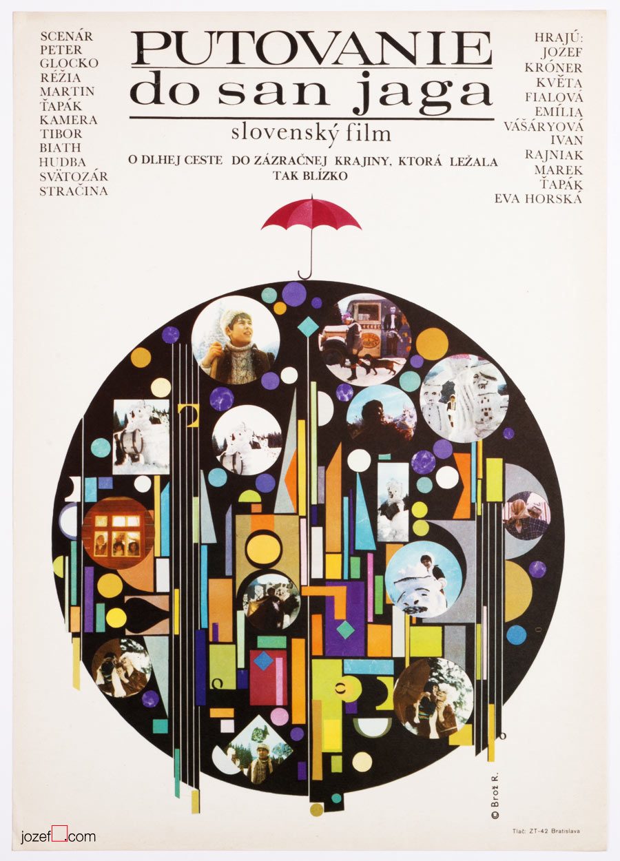
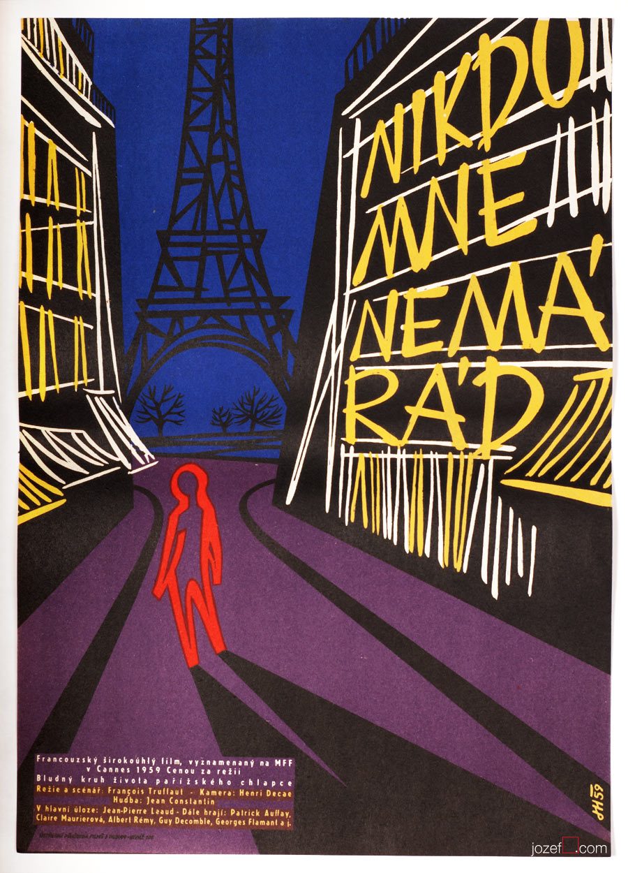
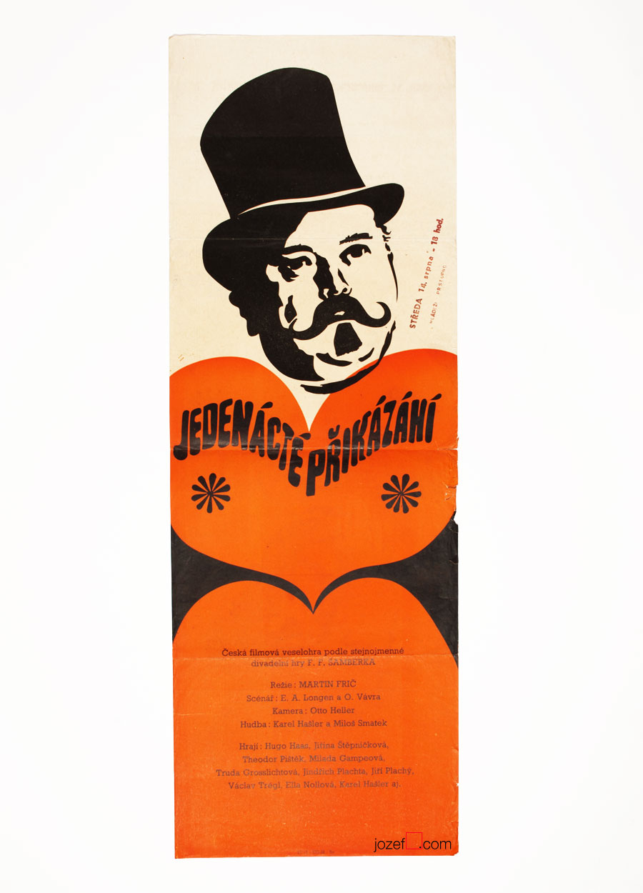
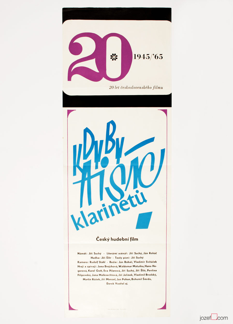
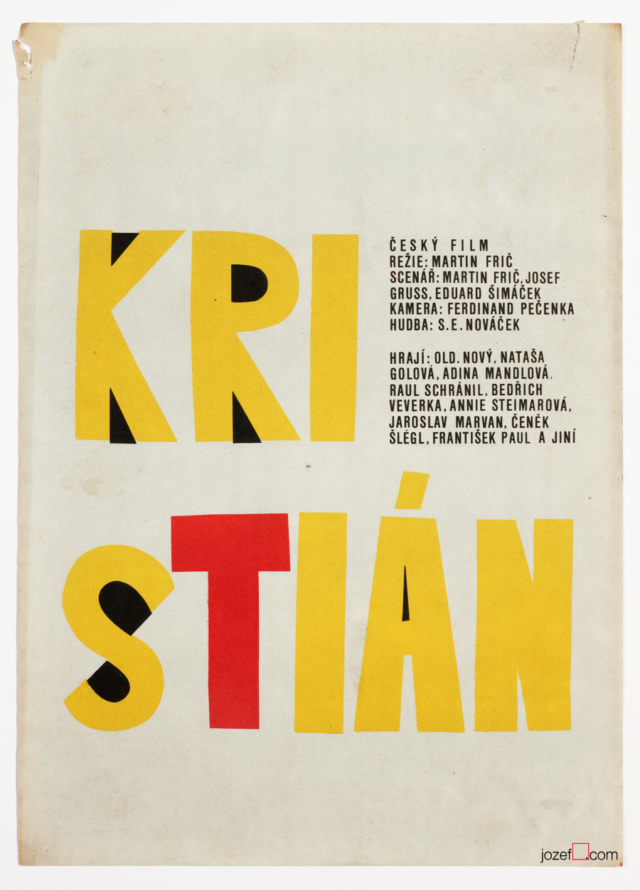
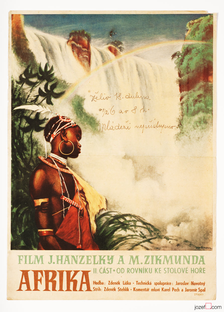
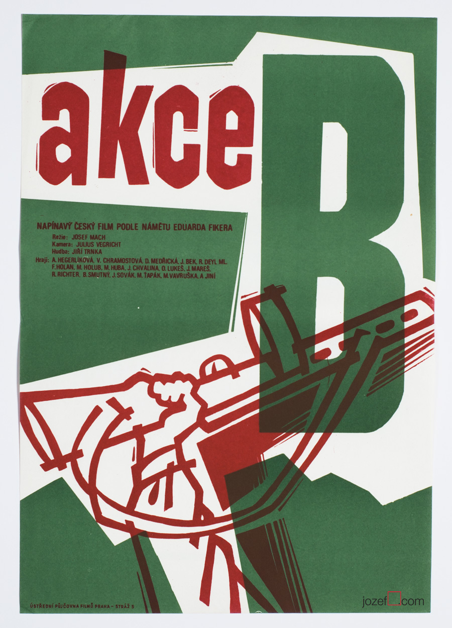
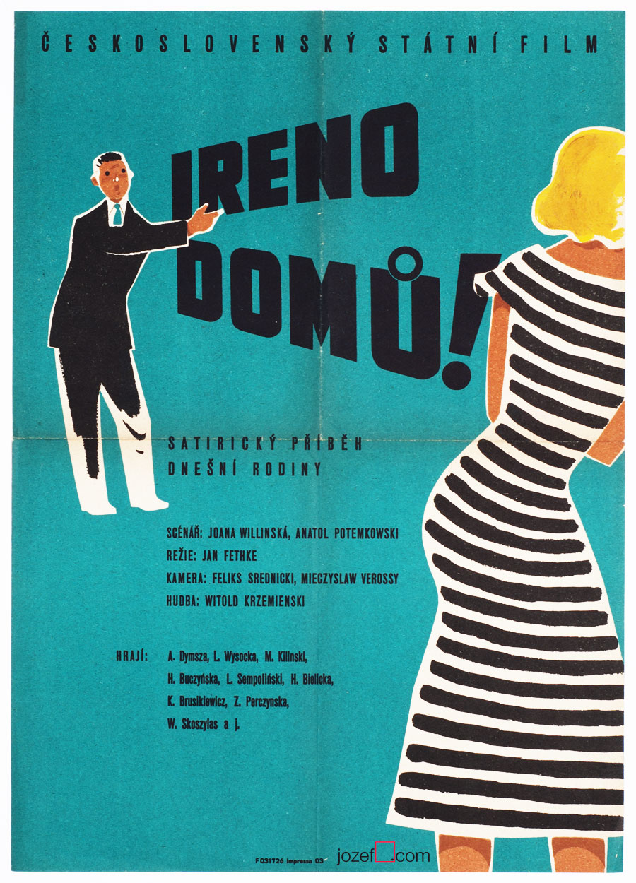
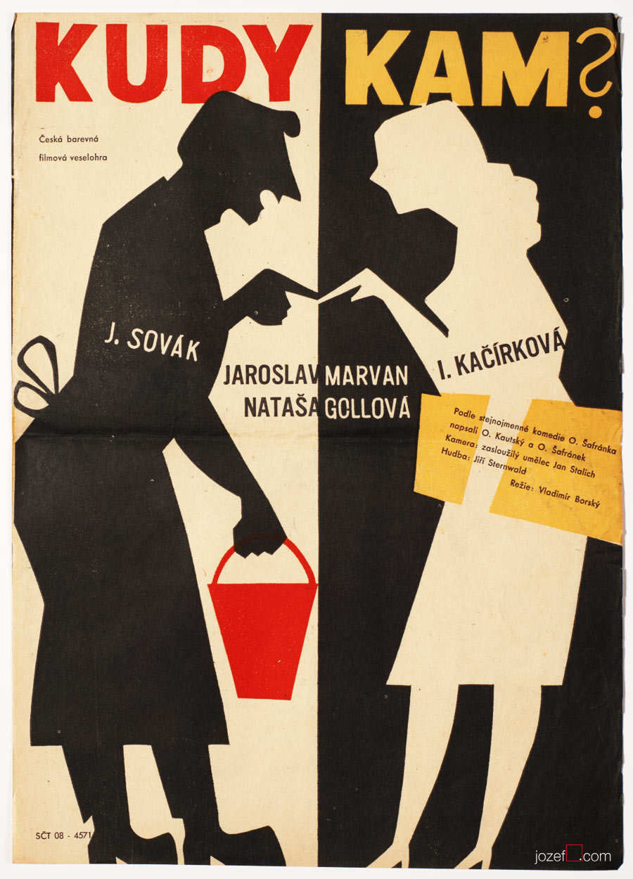
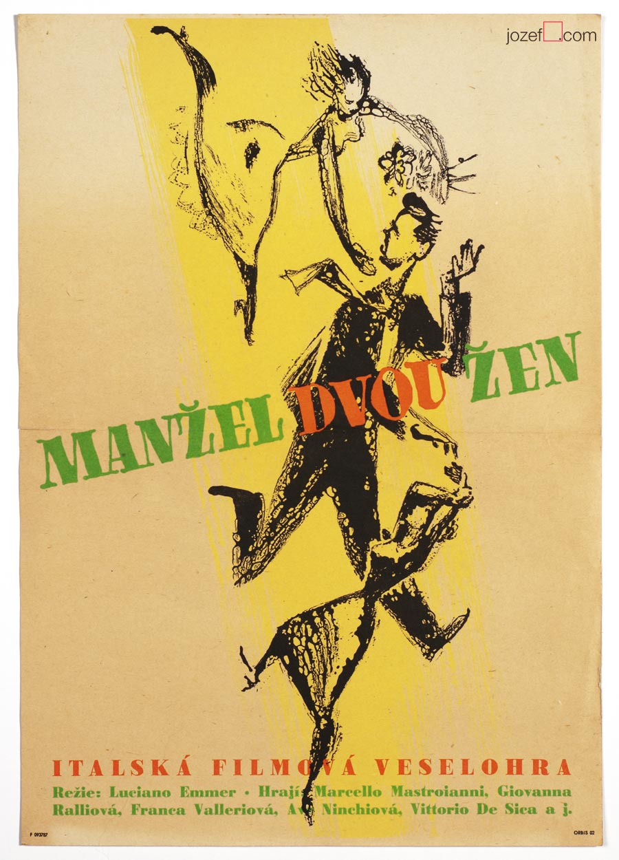
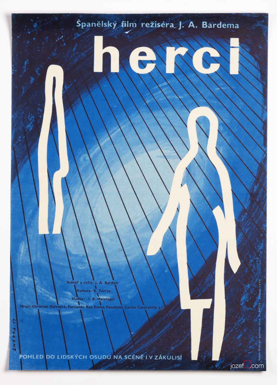
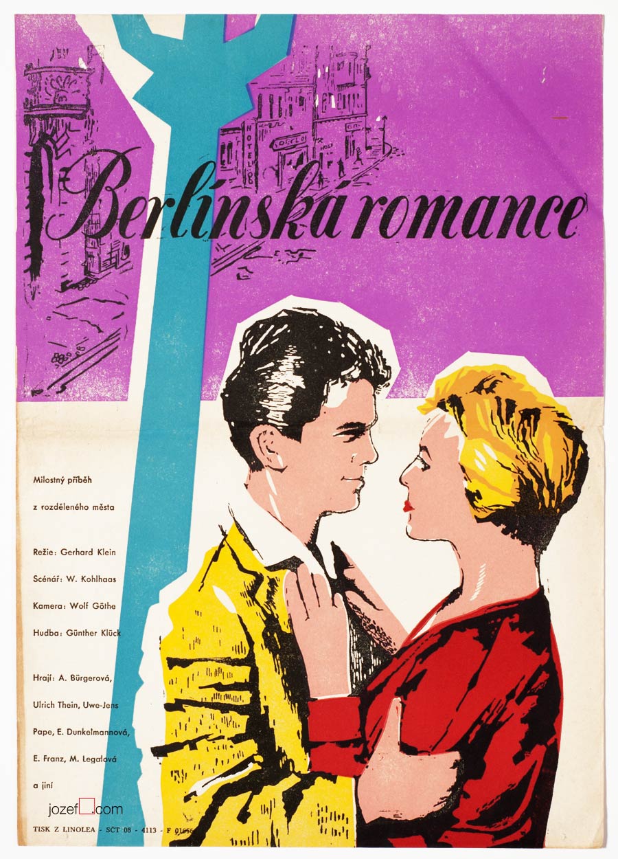
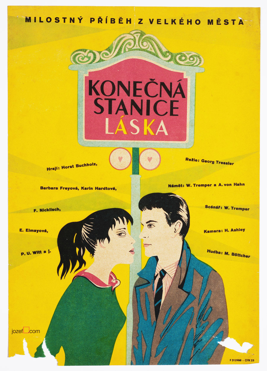
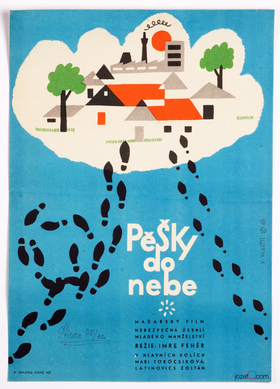
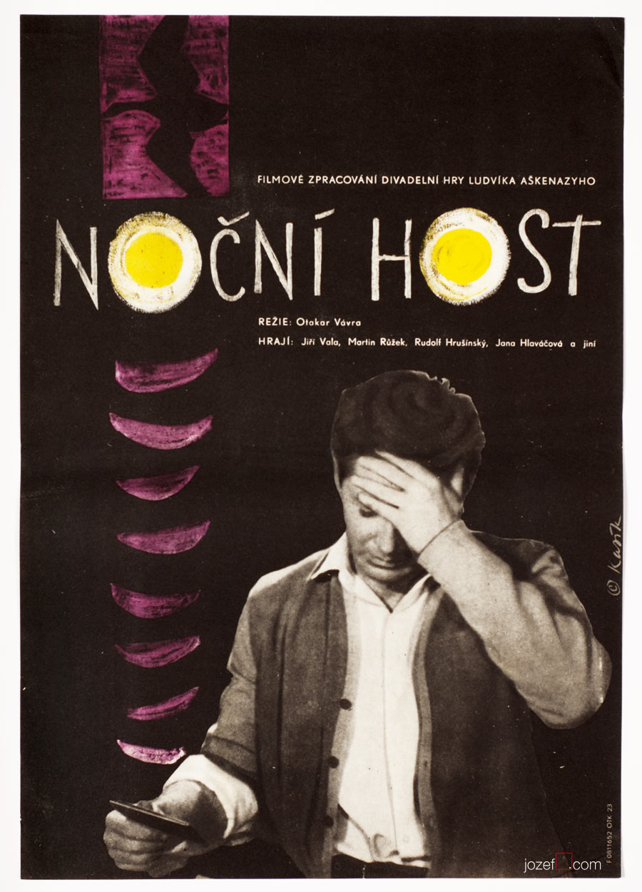
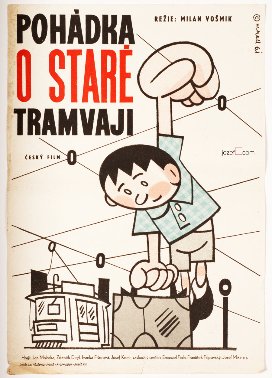
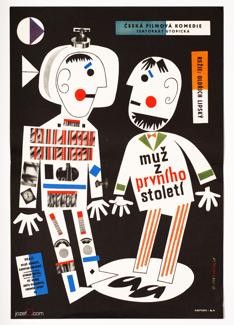
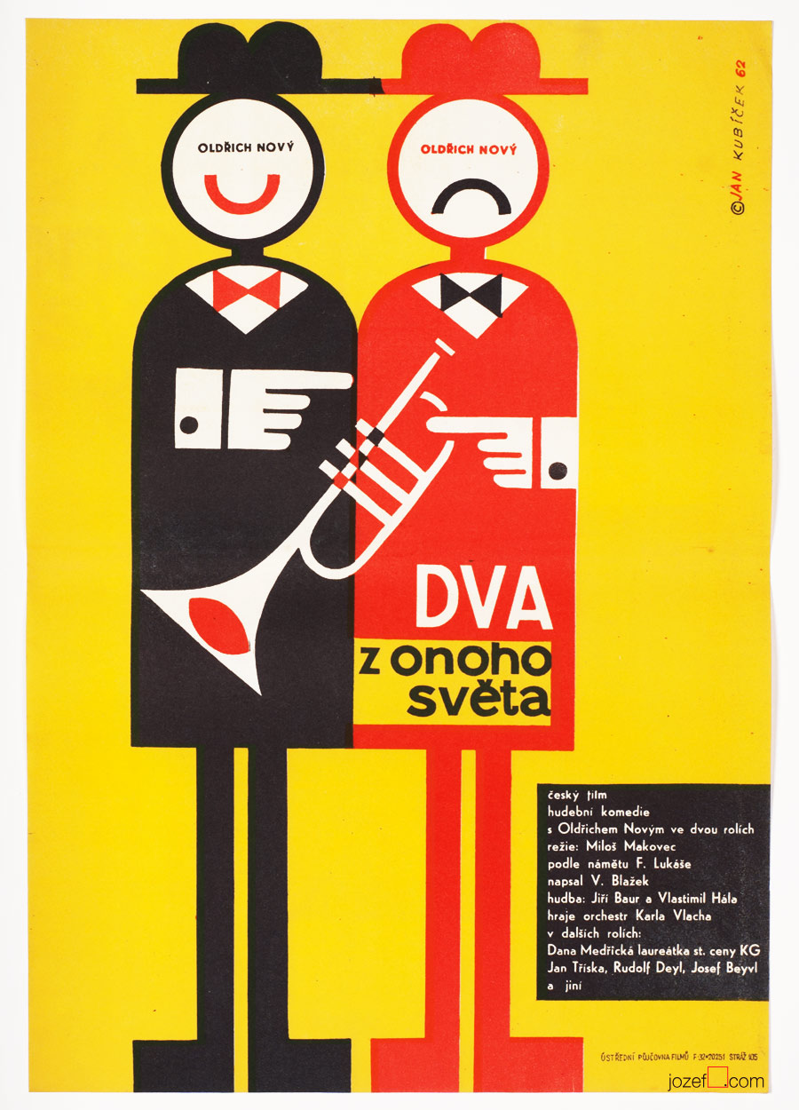
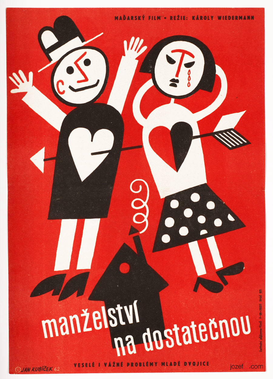
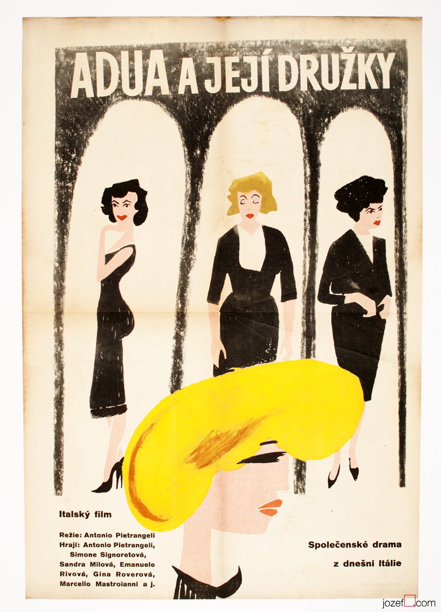
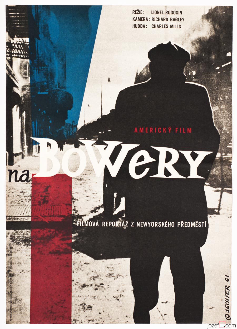
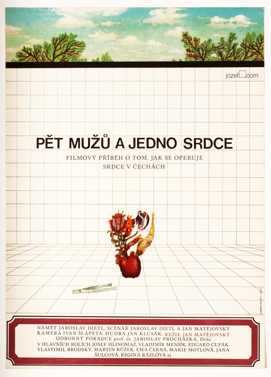
As for the film poster Bedřich Dlouhý was testing the new medium so intensely as anything else. His posters might appear visually settled and designed in quite minimalist style. In our examples even his typography might look very basic. Less is more, but not for Bedřich Dlouhý’s movie posters. They are full of hidden symbols and impressions even when they seem so simple.
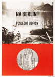
Please come closer and let’s take a look at his The Fall of Berlin movie poster for instance. Fairly suggestive photograph of burning German capital is taking over the larger part of the poster. Pure catastrophe straight into ones face and quite rightly in monochrome. Message is very simple, anyone could guess what the movie poster offers. Bedřich Dlouhý does not want you to only see the movie but he also wants you to use the rest of your senses.
[quote]”I enjoyed improvising incredibly.” [^7][/quote]
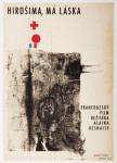
He takes your attention a bit further by exploring the large circle in the middle of the rich red bottom half of the poster. Red colour could represent the tons of blood and it is possibly also used to say big STOP. Almost like the red colour on traffic light advising one to stop, only the circle here is empty. Negating reality and pointing out that people will never learn. Or take the circle together with rectangularly shaped photograph. Two objects want to look little something like exclamation mark and set the message to following? STOP THIS! ? Similarly to the inner part of the circle that tells how it could all end up if we do not stop the wars. His movie poster for Hiroshima Mon Amour was designed in absolutely different style, but the poster also suggests close catastrophe.
•••
•••
There are not only serious movie posters author has designed, he does not omit humour and irony (posters designed for The Pink Panther / Blake Edwards in 1966 or In the Woods / Akira Kurosawa in 1970 ) [^8] when necessary. He does not use any particular style either, but instead he approaches each individual poster very differently. The one connecting link we have found is that Bedřich Dlouhý’s curiosity does not like to leave things as they are. He wants to get right into to the core of his subject by bringing out the deepest details and he starts from there. He slips between the most complicated expressive forms (techniques frequently used in his paintings) [^9] to the most simple designs masterly. Visual illusion and yet with fantastically clear almost microscopic explanation.
Even thought Bedřich Dlouhý created some of the most iconic movie posters of the 60s, his unconventional approach to art form did not meet with the official agenda of the following decade. Similarly to many other artists in the beginning of the 70s he was forced to stop exhibiting and discontinued with designing movie posters.
Note: this showcase is part of our ongoing article Film posters / Made in Czechoslovakia. The story of film posters.
Available posters designed by the artist.
•••
Resources:
Literature:
- Collective authors: Czech film posters of 20th century / The Moravian Gallery in Brno, Exlibris Prague, 2004.
- [^2]: Flashback / Czech and Slovak Film Posters 1959-1989, ed. Libor Gronský, Marek Perůtka, Michal Soukup, Olomouc Museum of Art, 2004. (p.49). 25 movie posters to our knowledge.
- Tomáš Vlček: Současný Plakát / Contemporary Poster, Odeon, Prague, 1976.
- Československý Plakát / Czechoslovak Poster, exhibition catalogue, Olomouc (Czech Republic), 1967. One of the most important poster exhibition in the history of Czechoslovak poster design. We wish to return back to catalogue and give it a full blog post once we are ready.
Online:
- [^1]: abArt / Bedřich Dlouhý / see for the full list of exhibitions. abArt takes always first place and star when it comes to research.
- [^3]: / [^4]: Czech Radio Archive / offers few of his interviews
- [^5]: / [^6]: / [^7]: Fenomém Underground / Underground Phenomenon (unofficial title), Collective authors, 2012. Documentary made for Czech Television. 52 min.
- [^8]: Filmový plakát (Bedřich Dlouhý) / excellent archive of Czechoslovak poster art
Additional research:
- for Pinterest users, some posters are available to see in our board
- [^9]: Museum Montanelli, Prague / Return of the King, exhibition 2015
•••
For shop and blog highlights, please SUBSCRIBE to our newsletter.

