Book Illustration / Caricature / Film Animation / Painting
***
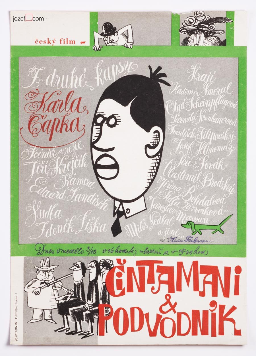
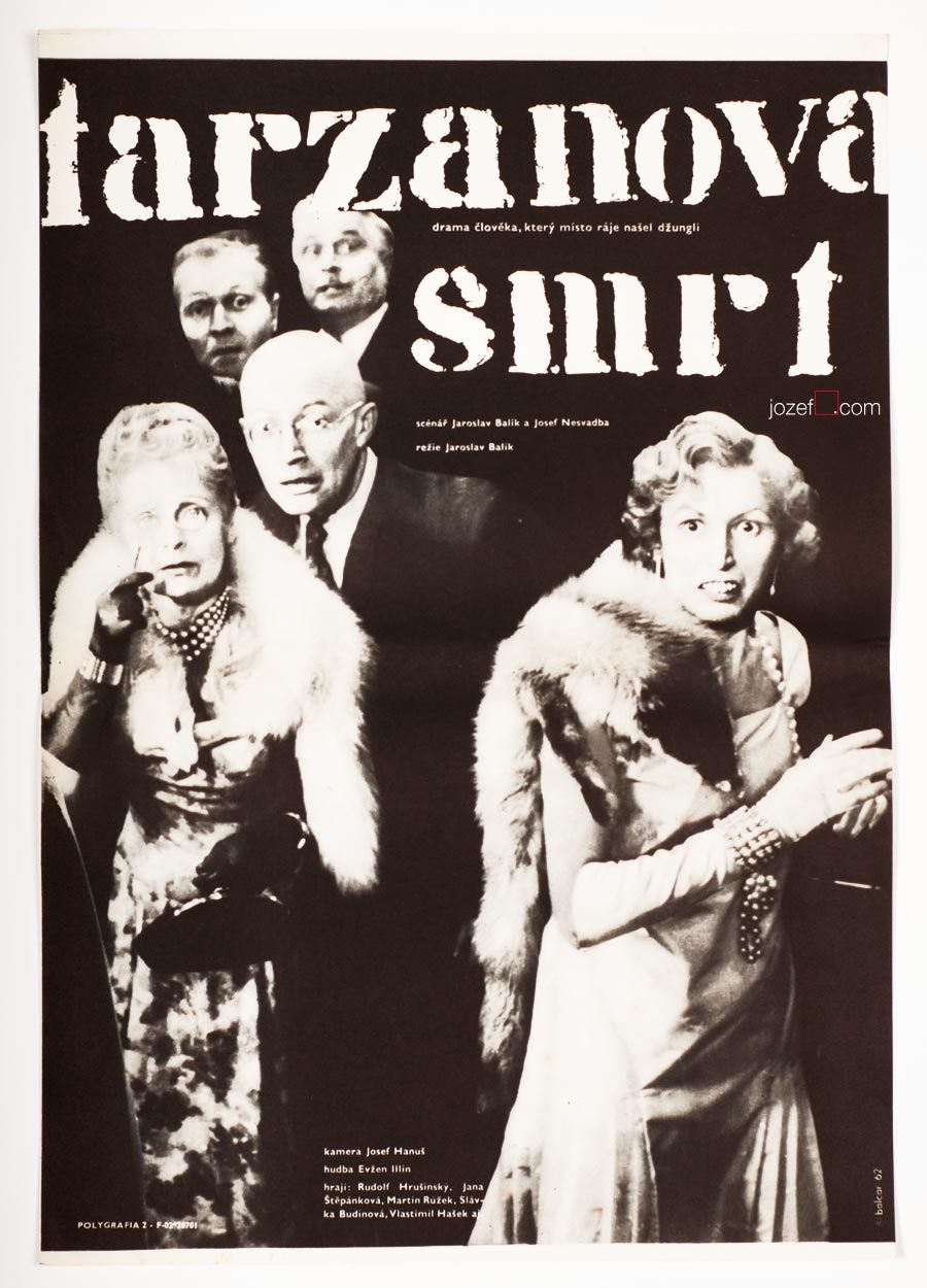
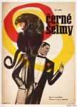
Jan Brychta’s poster design for movie adaptation of Karel Čapek’s novel, 1964.
***
11th of May 1928, Mladá Boleslav, Czech Republic
14th of November 2013, London (?), United Kingdom
lived in London exile since 1968
Education:
State Graphic School, Prague (Zdeněk Balaš, Josef Vodrážka)
1945 – 19.., Academy of Arts, Architecture and Design in Prague (Josef Kaplický, Antonín Pelc)
Exhibitions:
from late 1950s until 1968 mostly Prague exhibitions
Surrealism Unlimited 1968 – 1978, Camden Arts Centre, London 1978
Awards for Film Animation:
The main prize in the category of animated films, Oberhausen 1966
The prize of the union of cinema owners, Oberhausen 1966
Grand Prix “Bronze Caesar”, Tours 1966
***
In 1968 Jan Brychta vanished off the face of the earth and that is the fact. Russian occupation of Czechoslovakia in 1968 brought in many immediate changes within the state. Political trials were about to return back to fashion and not everyone was waiting for the resume. Or at least Jan Brychta did not.
It would be hard to say what made such a successful artist leave his homeland, as Jan Brychta’s art was everywhere and available to everyone in all possible forms. From beautifully illustrated books, film animations to caricatures in daily newspaper and television graphics / adverts. Simply put 1960s daily life was somehow incomplete without Jan Brychta.
***
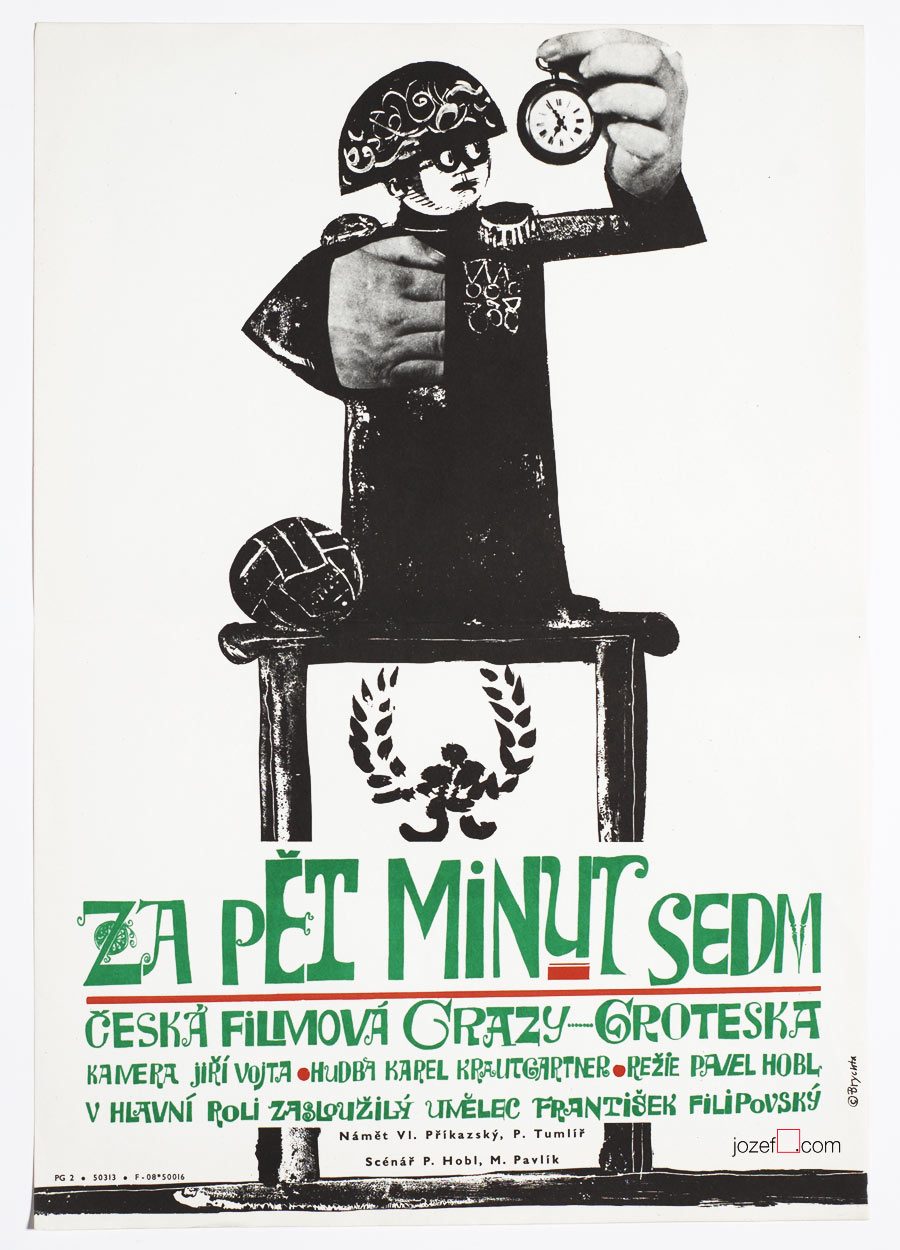
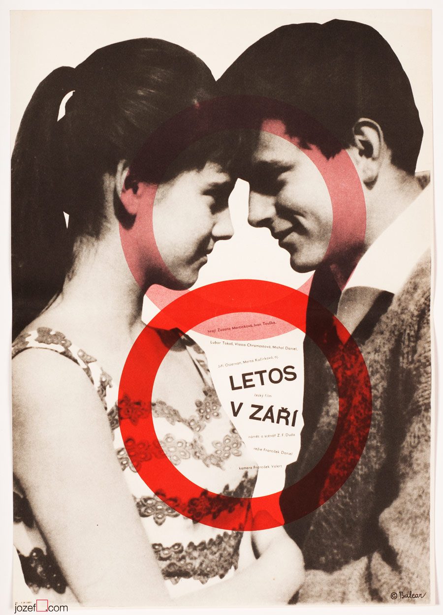
Five Minutes to Seven movie poster by Jan Brychta, 1965.
***
It is fascinating to watch how with short step in time and history someone so publicly pleasing can become persona non grata. Researching many years later it really looks that party members did a great job. There was no Jan Brychta after 1968 in Czechoslovakia and same for his wife Lída Brychtová (artist and book illustrator) as they managed to escape the country together with their children Edita and Aleš.
Through out his Czechoslovak career as a daily caricaturist, film animator and pioneer of television graphics Jan Brychta was never far away from the movie poster. His rapid illustration and excellent story telling could be easily applied to the discipline. As a surreal artist and two dimensional painter use of a collage and illustration was a natural choice. His portfolio ends with his disappearance in late 1960s. Jan Brychta’s posters are absolute pleasure to look at and it is real pity it does not contain more than ten movie posters. The master of many techniques with only one common goal which was to keep everyone amused.
***
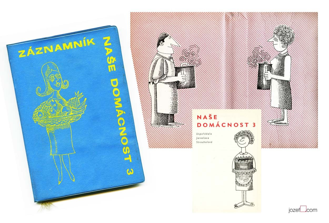
Our Household, third volume of the annual guide for modern family illustrated by Jan Brychta, 1963.
***
British audience could recognise Jan Brychta’s illustration thanks to BBC children’s television series Jackanory.
***
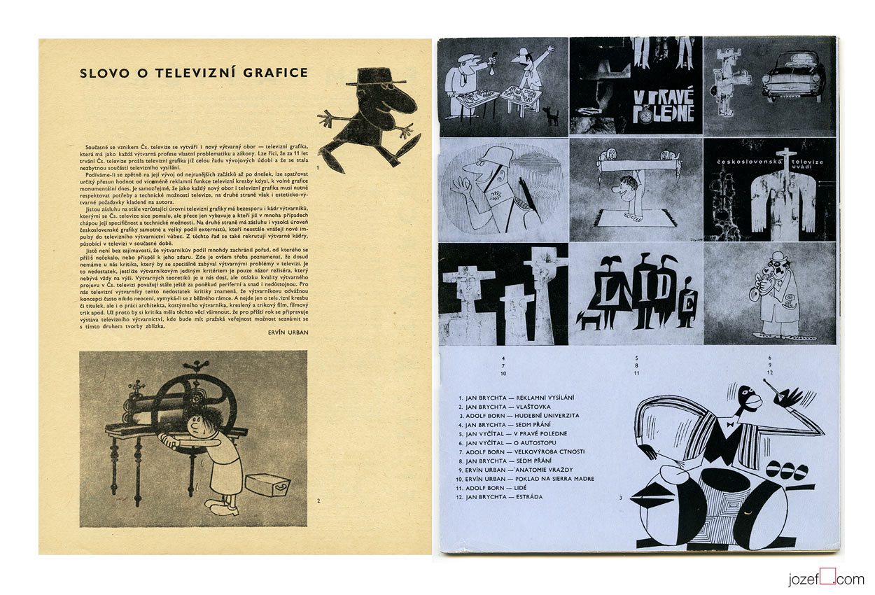
Television graphics by Jan Brychta, Adolf Born and other pioneers of 1960s TV visuals.
Krátky Film, Praha / Short Film, Prague. Archive of Jan Brychta’s 1960s animated films.
Images used:
Collective authors: Záznamník – Naše Domácnost 3 / Family Guide Jotter – Our Household Vol.3. Obchodní Tiskárny, Praha, 1963. Cover and inner pages of the book.
Film a Doba 1 / Film and Times 1 / Bratislava City Gallery, 1965. Magazine spread out.
This Year in September movie poster by Jiří Balcar, 1963.
***
Czech artist Jiří Balcar could easily belong to one of the most fascinating poster designers of the Sixties. It’s hard to judge by the small number of his posters in our collection, but his artwork as we are finding out, spreads all across the globe (short list bellow). Internationally started off at Farleigh Dickinson University in Madison (New Jersey) where he took part in International Invitational Seminar of Art, followed by exhibition in New York in 19643 , Berlin (1965-66) and Wien (1966). Paris exhibition in Musée d’Art Moderne (1969) was held soon after his early death in 1968.
A wide spectrum of his artistic experiments are brought in from the painting and are reflected in his poster designs. Extensive use of letter templates, sometimes broken into separate parts, wise and bright selection of colours (unless Monochromatic, or sensible mix of both), unconventional use of photography and perfect understanding of space. His faceless figures, motif reappearing on several of his paintings, could become alive only on the film poster.
[quote]”It may sound slightly disrespectful, but I am aware that I have a huge wide inventiveness and it makes and justifies me to take interest in many sectors of the art form.” 3[/quote]
We are somewhere in mid fifties, in times of the most absurd terror upon democracy, constant greyness (Stalin’s monument in Prague and similar monsters are being raised across the Czechoslovakia) and bleak vision of existence. At the Academy of Fine Art in Prague the group of three interesting characters are meeting up. In the following words we will try to get closer to one of them.
[quote]”I started out as no one in that field and I was getting jobs for pretty inconsequential films from Romania, Bulgaria and Russia. They were productions of a third or second category. Because of the impressive quality of my work, film poster committee and ÚPF representatives (Formal state film distribution 1957 – 1991) were constantly adding to a momentum. It was reflected in good quality commissions for example for Fellini’s or Visconti’s magnum opus. I had to earn it.” 4[/quote]
Bedřich Dlouhý was not such a tyro/novice at the beginning of his poster designing career as he explains in the quote above. By the time he started to design movie posters (1962) his portfolio contained already good body of art work, some important exhibitions and possibly something extra to it. To his future colleagues he must have been known as someone incredibly talented, the man without hesitation and very likely also without compromise.
•••
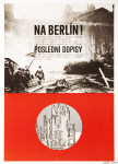
The Fall of Berlin movie poster by Bedřich Dlouhý, 1968.
•••
Neglecting the art
Among Bedřich Dlouhý’s best early pieces was exhibiting with art group Šmídrové. Their first exhibition in 1954 called Malmuzherziáda (varieté of painting, music and act as we understand) was made in the hardest times of Stalinist propaganda and Social Realism. Jan Koblasa (Czech artist and the member of the group) in the documentary made for Czech Television demonstrates the climate of late fifties as “very dark and grey”. Days in art school, as days among communist collaborators (“recommended working class was gaining high school diplomas to get legal access to Universities). Loneliness among them was unbearable.” 5 No wonder that the three of them had met under such a circumstances. The group itself had very playful character with Neo Dadaist expression, hockey team and brass band.(Traditional folk music was not in favour of communist propaganda either, they had their own songs full of ridiculous slogans.)
[quote]“We loathed to look as an artists. We loathed to do things as an artists. We played hockey as part of our manifest Šmídrové. It may sound unbelievable, but the main thing was not to be an artist.” 6[/quote]
After their first collaborative exhibition the group was officially established. Show or rather happening in 1957 called “Exhibition for one day” brought in too much controversy. Event had to be cancelled in duration, but it took place elsewhere the following day. On the day one Václav Havel (Czech writer, poet, ex-president) was giving the speech and on the second day he was already taking part with good number of other artists and musicians. Bedřich Dlouhý’s discharge from the Academy followed and lasted for a while.
Poster days and …
As for the film poster Bedřich Dlouhý was testing the new medium so intensely as anything else. His posters might appear visually settled and designed in quite minimalist style. In our examples even his typography might look very basic. Less is more, but not for Bedřich Dlouhý’s movie posters. They are full of hidden symbols and impressions even when they seem so simple.
Please come closer and let’s take a look at his The Fall of Berlin movie poster for instance. Fairly suggestive photograph of burning German capital is taking over the larger part of the poster. Pure catastrophe straight into ones face and quite rightly in monochrome. Message is very simple, anyone could guess what the movie poster offers. Bedřich Dlouhý does not want you to only see the movie but he also wants you to use the rest of your senses.
He takes your attention a bit further by exploring the large circle in the middle of the rich red bottom half of the poster. Red colour could represent the tons of blood and it is possibly also used to say big STOP. Almost like the red colour on traffic light advising one to stop, only the circle here is empty. Negating reality and pointing out that people will never learn. Or take the circle together with rectangularly shaped photograph. Two objects want to look little something like exclamation mark and set the message to following? STOP THIS! ? Similarly to the inner part of the circle that tells how it could all end up if we do not stop the wars. His movie poster for Hiroshima Mon Amour was designed in absolutely different style, but the poster also suggests close catastrophe.
•••
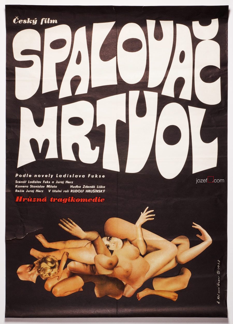
Five Men and One Heart movie poster by Bedřich Dlouhý, 1971.
•••
There are not only serious movie posters author has designed, he does not omit humour and irony (posters designed for The Pink Panther / Blake Edwards in 1966 or In the Woods / Akira Kurosawa in 1970 ) 8 when necessary. He does not use any particular style either, but instead he approaches each individual poster very differently. The one connecting link we have found is that Bedřich Dlouhý’s curiosity does not like to leave things as they are. He wants to get right into to the core of his subject by bringing out the deepest details and he starts from there. He slips between the most complicated expressive forms (techniques frequently used in his paintings) 9 to the most simple designs masterly. Visual illusion and yet with fantastically clear almost microscopic explanation.
Even thought Bedřich Dlouhý created some of the most iconic movie posters of the 60s, his unconventional approach to art form did not meet with the official agenda of the following decade. Similarly to many other artists in the beginning of the 70s he was forced to stop exhibiting and discontinued with designing movie posters.
Collective authors: Czech film posters of 20th century / The Moravian Gallery in Brno, Exlibris Prague, 2004.
2. Flashback / Czech and Slovak Film Posters 1959-1989, ed. Libor Gronský, Marek Perůtka, Michal Soukup, Olomouc Museum of Art, 2004. (p.49). 25 movie posters to our knowledge.
Tomáš Vlček: Současný Plakát / Contemporary Poster, Odeon, Prague, 1976.
Československý Plakát / Czechoslovak Poster, exhibition catalogue, Olomouc (Czech Republic), 1967. One of the most important poster exhibition in the history of Czechoslovak poster design. We wish to return back to catalogue and give it a full blog post once we are ready.
Online:
1.abArt / Bedřich Dlouhý / see for the full list of exhibitions. abArt takes always first place and star when it comes to research.
The Cremator movie poster by Antonín Dimitrov, 1968.
***
b. 27th February 1928, Mšecké Žehrovice/Rakovník, Czech Republic
d. 27th December 2014, Bobcaygeon, Canada
lived in Canadian exile from 1968
Education:
1945 – 1953, Academy of Arts, Architecture and Design in Prague (Antonín Strnadel)
Exhibitions:
until 1968 mostly Prague exhibitions
Toronto, Royal Canadian Academy of Arts (member), Canada, 1991
London / United Kingdom
***
In few of our recent articles we have discussed absurdity and inappropriate behaviour of Communist leaders. Terrifying act of those in power and their constant fight towards fictional enemy was very systematical. In country as small as Czechoslovakia it was not impossible to succeed.
***
Four in a Circle movie poster by Antonín Dimitrov, 1967.
***
Similarly to Jan Brychta, Antonín Dimitrov’s profile was simply deleted. Second successful attempt of leaving the country in 1968 took Antonín Dimitrov with his wife Olga to Canada. His first try when he and his soul mate swam across the river Danube to neighbouring Austria, just to get caught and handed in to Russian soldiers, cost him several years in prison and forced labor.
Before their disappearance, Antonín Dimitrov and his wife worked professionally as a set and costume designers in various theatres across the country. Antonín’s rebellious nature has been proved several times. Exclusion from the Art Academy for his incorrect political views (note: even the students had to be the members of Communist party. Same applied to parents, if there was a non member in the family, studying at higher education was impossible. Not talking of grand parents.) and his unsuccessful immigration right after that are only few examples of his misbehaviour.
***
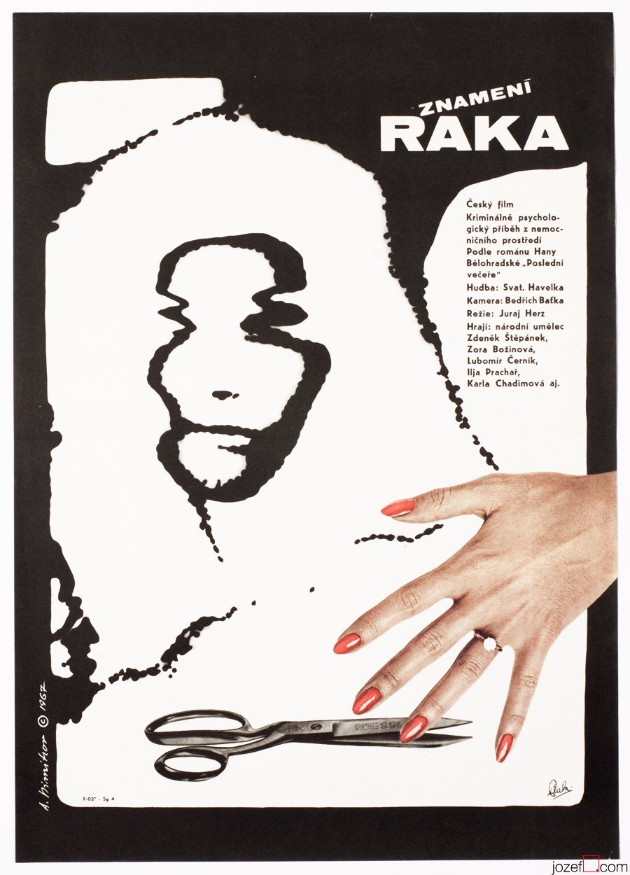
Sign of the Cancer movie poster by Antonín Dimitrov, 1967.
***
His collaboration with Czechoslovak New Wave directors, specially with Juraj Herz must have also spiced the soup up. Juraj Herz’s Cremator was the movie Communist could not swallow, similarly to other two titles in the showcase. In cases when the Communists decided to ban the movie everything would go off the shelf. Film director, author of the script / writer and the same destiny would meet the film poster.
Movie posters of Antonín Dimitrov are reflecting the times utterly. His posters are incredibly attractive, no matter if he touches the scissors or the paint brush. Excellent typographer and master of the blend, his virtues are sensibly hidden mostly in the collage. His posters are missing on one thing, there are only very few of them. He possibly did not design more than ten movie posters.
***
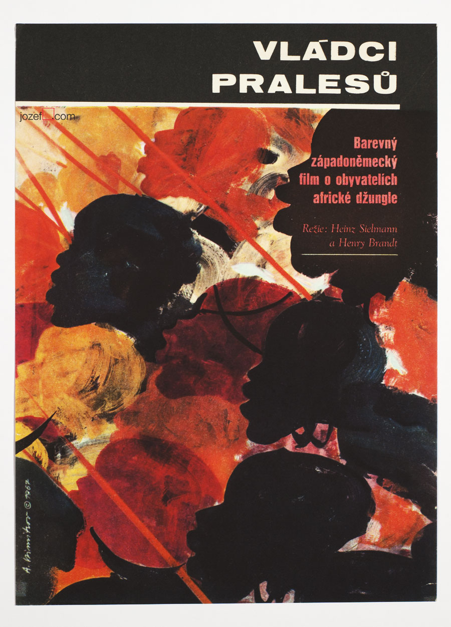
Masters of Congo Jungle movie poster by Antonín Dimitrov, 1967.
***
Even though Antonín Dimitrov luckily led succesful life in the exile. As a set designer he and his wife worked on numerous theatre and opera productions. He was also head of the design programme at the prestigious Indiana University School of Music in Bloomington, Indiana1 . But for Czechoslovak film poster his departure was a great loss. Many fascinating artists remained and learn how to overcome the situation, while building one of the most impressive poster archive in design history. It would be truly interesting to see what else could Antonín Dimitrov pull out of that hat.
***
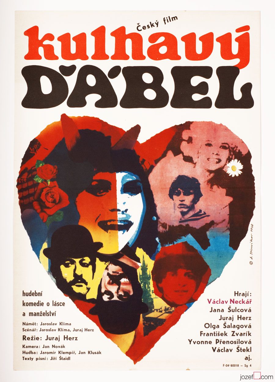
The Limping Devil movie poster by Antonín Dimitrov, 1968.
1.Obituary of Antonin Dimitrov, Hendren Funeral Homes, Norwood and Bobcaygeon, Ontario / it is sad when only biography on artist can be found in his obituary. Beautifully written, one should take a look.
***
For shop and blog highlights, please SUBSCRIBE to our newsletter.
Book Illustration / Fine Art / Graphic Design / Typography
•••
Legacy of the Incas movie poster by Josef Duchoň, 1967.
•••
b. 17th January 1929, Hostěradice (Prague-West), Czech Republic
Education:
1945 − 1949, State Graphic School, Prague (Richard Lander)
1949 − 1955, Academy of Arts, Architecture and Design, Prague (Karel Svolinský)
Art Groups:
Association of Czech Graphic Artists Hollar / Sdružení českých umělců grafiků Hollar (1957)
May 57 / Máj 57 (1964)
•••
Remember the day when we were unfolding our first large size movie poster. There was quite an excitement about the whole thing. Firstly it was about the size of a poster. All of our movie posters were in A3 size until then and we were astonished by the remarkable change in dimensions. Almost three times larger in size, movie poster offered much clearer detail and we had impression that printing was handled with slightly extra care. For common reason as we had later found out, A1 posters were bit more representative, they were used occasionally for poster exhibitions. Our second astonishment was the visual content.
•••
Black Panther movie poster by Josef Duchoň, 1966.
•••
Josef Duchoň’s lovingly puzzled collage for children’s adventurous movie set in the jungle (Black Mountain, 1972) was tenderly looking at us. What a joy! His movie posters have become one of our most favourite ever since. As we are describing the temperature, we could also mention, that we have very similar feelings towards Ever Alexander Půček‘s children’s posters.
Fascination of Josef Duchoň with children’s fantasy is in the right place and it was frequently reflected in his book illustrations. From 1959 he was co-working for the State publisher of children book as an illustrator. Early 1960s brought Josef Duchoň also to movie poster design. He created over two dozens of exceptionally impressive movie posters in period of almost 20 years1.
His work is extremely explosive, but not in a destructive way. On the other hand, Josef Duchoň is using the mixture of several artistic methods to reach viewer’s sensation. As a surreal artist his choice of collage technique is natural. Wonderful variation of live pastel colours achieved by the use of elegantly shaped and carefully placed woodcuts and his manipulation with objects is masterful. Thanks to monochrome cut outs and neat typography his movie posters are gaining quite significant depth and very vibrant character.
•••
The Birds the Bees and the Italians movie poster by Josef Duchoň, 1967.
•••
Josef Duchoň started exhibiting as a member of Association of Czech Graphic Artists Hollar in mid 1950s2. (Important art group established in Prague, 1917.) Among 1613 Czech leading artists and graphic designers one can find other interesting poster artists such as Jiří Balcar, Adolf Born, Jan Kubíček, Jiří Šalamoun or Jaroslav Sůra to name few.
His first solo exhibition is dated to 1960. Liberal Czechoslovakia allowed Josef Duchoň to exhibit work also internationally. He took part in Biennale of Young Artists / Paris (France, 1963), Intergrafik / Berlin (Germany, 1965), Myth of the XXth Century / Coventry (UK, 1967) or in exhibition of Czech graphic artists in Oregon (USA, 1967). It seems that 1970s political changes stopped his exhibition activities for some time. There was no place for surreal, or any sort of abstraction in uniformed Czechoslovakia. However children’s publications were not censored, anything was possible in there and movie posters just very mildly4. Josef Duchoň remained faithful to a fantasy.
Please see other fascinating posters designed by the artist.
•••
Resources:
Literature:
1. Collective authors: Czech film posters of 20th century / The Moravian Gallery in Brno, Exlibris Prague, 2004. Josef Duchoň’s movie poster appears in year 1964 in their chronological catalogue. Our poster archive dates his movie poster activity up to 1981.
Online:
2.abArt / Josef Duchoň / Big thanks to abArt for their research on invisible.
We have prepared another Poster Sale to make our film poster collection accessible to anyone as passionate about the art from Czechoslovakia as we are. Please take advantage of our Poster Sales to get your hands on some of the best designs in the history of poster art. Enter the coupon –
poster art
– into a coupon field when checking out. Sale will run until 7.11.2015. Enjoy!
You can also tell your friends by sharing this link (bellow).
Note: Free shipping on multiple orders. Secure checkout.
Poster Sales. 22% off your basket. Type – poster art – in coupon field when checking out.
This Year in September movie poster by Jiří Balcar, 1963.
***
Czech artist Jiří Balcar could easily belong to one of the most fascinating poster designers of the Sixties. It’s hard to judge by the small number of his posters in our collection, but his artwork as we are finding out, spreads all across the globe (short list bellow). Internationally started off at Farleigh Dickinson University in Madison (New Jersey) where he took part in International Invitational Seminar of Art, followed by exhibition in New York in 19643 , Berlin (1965-66) and Wien (1966). Paris exhibition in Musée d’Art Moderne (1969) was held soon after his early death in 1968.
A wide spectrum of his artistic experiments are brought in from the painting and are reflected in his poster designs. Extensive use of letter templates, sometimes broken into separate parts, wise and bright selection of colours (unless Monochromatic, or sensible mix of both), unconventional use of photography and perfect understanding of space. His faceless figures, motif reappearing on several of his paintings, could become alive only on the film poster.
[quote]”It may sound slightly disrespectful, but I am aware that I have a huge wide inventiveness and it makes and justifies me to take interest in many sectors of the art form.” 3[/quote]
We are somewhere in mid fifties, in times of the most absurd terror upon democracy, constant greyness (Stalin’s monument in Prague and similar monsters are being raised across the Czechoslovakia) and bleak vision of existence. At the Academy of Fine Art in Prague the group of three interesting characters are meeting up. In the following words we will try to get closer to one of them.
[quote]”I started out as no one in that field and I was getting jobs for pretty inconsequential films from Romania, Bulgaria and Russia. They were productions of a third or second category. Because of the impressive quality of my work, film poster committee and ÚPF representatives (Formal state film distribution 1957 – 1991) were constantly adding to a momentum. It was reflected in good quality commissions for example for Fellini’s or Visconti’s magnum opus. I had to earn it.” 4[/quote]
Bedřich Dlouhý was not such a tyro/novice at the beginning of his poster designing career as he explains in the quote above. By the time he started to design movie posters (1962) his portfolio contained already good body of art work, some important exhibitions and possibly something extra to it. To his future colleagues he must have been known as someone incredibly talented, the man without hesitation and very likely also without compromise.
•••
The Fall of Berlin movie poster by Bedřich Dlouhý, 1968.
•••
Neglecting the art
Among Bedřich Dlouhý’s best early pieces was exhibiting with art group Šmídrové. Their first exhibition in 1954 called Malmuzherziáda (varieté of painting, music and act as we understand) was made in the hardest times of Stalinist propaganda and Social Realism. Jan Koblasa (Czech artist and the member of the group) in the documentary made for Czech Television demonstrates the climate of late fifties as “very dark and grey”. Days in art school, as days among communist collaborators (“recommended working class was gaining high school diplomas to get legal access to Universities). Loneliness among them was unbearable.” 5 No wonder that the three of them had met under such a circumstances. The group itself had very playful character with Neo Dadaist expression, hockey team and brass band.(Traditional folk music was not in favour of communist propaganda either, they had their own songs full of ridiculous slogans.)
[quote]“We loathed to look as an artists. We loathed to do things as an artists. We played hockey as part of our manifest Šmídrové. It may sound unbelievable, but the main thing was not to be an artist.” 6[/quote]
After their first collaborative exhibition the group was officially established. Show or rather happening in 1957 called “Exhibition for one day” brought in too much controversy. Event had to be cancelled in duration, but it took place elsewhere the following day. On the day one Václav Havel (Czech writer, poet, ex-president) was giving the speech and on the second day he was already taking part with good number of other artists and musicians. Bedřich Dlouhý’s discharge from the Academy followed and lasted for a while.
Poster days and …
As for the film poster Bedřich Dlouhý was testing the new medium so intensely as anything else. His posters might appear visually settled and designed in quite minimalist style. In our examples even his typography might look very basic. Less is more, but not for Bedřich Dlouhý’s movie posters. They are full of hidden symbols and impressions even when they seem so simple.
Please come closer and let’s take a look at his The Fall of Berlin movie poster for instance. Fairly suggestive photograph of burning German capital is taking over the larger part of the poster. Pure catastrophe straight into ones face and quite rightly in monochrome. Message is very simple, anyone could guess what the movie poster offers. Bedřich Dlouhý does not want you to only see the movie but he also wants you to use the rest of your senses.
He takes your attention a bit further by exploring the large circle in the middle of the rich red bottom half of the poster. Red colour could represent the tons of blood and it is possibly also used to say big STOP. Almost like the red colour on traffic light advising one to stop, only the circle here is empty. Negating reality and pointing out that people will never learn. Or take the circle together with rectangularly shaped photograph. Two objects want to look little something like exclamation mark and set the message to following? STOP THIS! ? Similarly to the inner part of the circle that tells how it could all end up if we do not stop the wars. His movie poster for Hiroshima Mon Amour was designed in absolutely different style, but the poster also suggests close catastrophe.
•••
Five Men and One Heart movie poster by Bedřich Dlouhý, 1971.
•••
There are not only serious movie posters author has designed, he does not omit humour and irony (posters designed for The Pink Panther / Blake Edwards in 1966 or In the Woods / Akira Kurosawa in 1970 ) 8 when necessary. He does not use any particular style either, but instead he approaches each individual poster very differently. The one connecting link we have found is that Bedřich Dlouhý’s curiosity does not like to leave things as they are. He wants to get right into to the core of his subject by bringing out the deepest details and he starts from there. He slips between the most complicated expressive forms (techniques frequently used in his paintings) 9 to the most simple designs masterly. Visual illusion and yet with fantastically clear almost microscopic explanation.
Even thought Bedřich Dlouhý created some of the most iconic movie posters of the 60s, his unconventional approach to art form did not meet with the official agenda of the following decade. Similarly to many other artists in the beginning of the 70s he was forced to stop exhibiting and discontinued with designing movie posters.
Collective authors: Czech film posters of 20th century / The Moravian Gallery in Brno, Exlibris Prague, 2004.
2. Flashback / Czech and Slovak Film Posters 1959-1989, ed. Libor Gronský, Marek Perůtka, Michal Soukup, Olomouc Museum of Art, 2004. (p.49). 25 movie posters to our knowledge.
Tomáš Vlček: Současný Plakát / Contemporary Poster, Odeon, Prague, 1976.
Československý Plakát / Czechoslovak Poster, exhibition catalogue, Olomouc (Czech Republic), 1967. One of the most important poster exhibition in the history of Czechoslovak poster design. We wish to return back to catalogue and give it a full blog post once we are ready.
Online:
1.abArt / Bedřich Dlouhý / see for the full list of exhibitions. abArt takes always first place and star when it comes to research.
The Cremator movie poster by Antonín Dimitrov, 1968.
***
b. 27th February 1928, Mšecké Žehrovice/Rakovník, Czech Republic
d. 27th December 2014, Bobcaygeon, Canada
lived in Canadian exile from 1968
Education:
1945 – 1953, Academy of Arts, Architecture and Design in Prague (Antonín Strnadel)
Exhibitions:
until 1968 mostly Prague exhibitions
Toronto, Royal Canadian Academy of Arts (member), Canada, 1991
London / United Kingdom
***
In few of our recent articles we have discussed absurdity and inappropriate behaviour of Communist leaders. Terrifying act of those in power and their constant fight towards fictional enemy was very systematical. In country as small as Czechoslovakia it was not impossible to succeed.
***
Four in a Circle movie poster by Antonín Dimitrov, 1967.
***
Similarly to Jan Brychta, Antonín Dimitrov’s profile was simply deleted. Second successful attempt of leaving the country in 1968 took Antonín Dimitrov with his wife Olga to Canada. His first try when he and his soul mate swam across the river Danube to neighbouring Austria, just to get caught and handed in to Russian soldiers, cost him several years in prison and forced labor.
Before their disappearance, Antonín Dimitrov and his wife worked professionally as a set and costume designers in various theatres across the country. Antonín’s rebellious nature has been proved several times. Exclusion from the Art Academy for his incorrect political views (note: even the students had to be the members of Communist party. Same applied to parents, if there was a non member in the family, studying at higher education was impossible. Not talking of grand parents.) and his unsuccessful immigration right after that are only few examples of his misbehaviour.
***
Sign of the Cancer movie poster by Antonín Dimitrov, 1967.
***
His collaboration with Czechoslovak New Wave directors, specially with Juraj Herz must have also spiced the soup up. Juraj Herz’s Cremator was the movie Communist could not swallow, similarly to other two titles in the showcase. In cases when the Communists decided to ban the movie everything would go off the shelf. Film director, author of the script / writer and the same destiny would meet the film poster.
Movie posters of Antonín Dimitrov are reflecting the times utterly. His posters are incredibly attractive, no matter if he touches the scissors or the paint brush. Excellent typographer and master of the blend, his virtues are sensibly hidden mostly in the collage. His posters are missing on one thing, there are only very few of them. He possibly did not design more than ten movie posters.
***
Masters of Congo Jungle movie poster by Antonín Dimitrov, 1967.
***
Even though Antonín Dimitrov luckily led succesful life in the exile. As a set designer he and his wife worked on numerous theatre and opera productions. He was also head of the design programme at the prestigious Indiana University School of Music in Bloomington, Indiana1 . But for Czechoslovak film poster his departure was a great loss. Many fascinating artists remained and learn how to overcome the situation, while building one of the most impressive poster archive in design history. It would be truly interesting to see what else could Antonín Dimitrov pull out of that hat.
***
The Limping Devil movie poster by Antonín Dimitrov, 1968.
1.Obituary of Antonin Dimitrov, Hendren Funeral Homes, Norwood and Bobcaygeon, Ontario / it is sad when only biography on artist can be found in his obituary. Beautifully written, one should take a look.
***
For shop and blog highlights, please SUBSCRIBE to our newsletter.
Book Illustration / Fine Art / Graphic Design / Typography
•••
Legacy of the Incas movie poster by Josef Duchoň, 1967.
•••
b. 17th January 1929, Hostěradice (Prague-West), Czech Republic
Education:
1945 − 1949, State Graphic School, Prague (Richard Lander)
1949 − 1955, Academy of Arts, Architecture and Design, Prague (Karel Svolinský)
Art Groups:
Association of Czech Graphic Artists Hollar / Sdružení českých umělců grafiků Hollar (1957)
May 57 / Máj 57 (1964)
•••
Remember the day when we were unfolding our first large size movie poster. There was quite an excitement about the whole thing. Firstly it was about the size of a poster. All of our movie posters were in A3 size until then and we were astonished by the remarkable change in dimensions. Almost three times larger in size, movie poster offered much clearer detail and we had impression that printing was handled with slightly extra care. For common reason as we had later found out, A1 posters were bit more representative, they were used occasionally for poster exhibitions. Our second astonishment was the visual content.
•••
Black Panther movie poster by Josef Duchoň, 1966.
•••
Josef Duchoň’s lovingly puzzled collage for children’s adventurous movie set in the jungle (Black Mountain, 1972) was tenderly looking at us. What a joy! His movie posters have become one of our most favourite ever since. As we are describing the temperature, we could also mention, that we have very similar feelings towards Ever Alexander Půček‘s children’s posters.
Fascination of Josef Duchoň with children’s fantasy is in the right place and it was frequently reflected in his book illustrations. From 1959 he was co-working for the State publisher of children book as an illustrator. Early 1960s brought Josef Duchoň also to movie poster design. He created over two dozens of exceptionally impressive movie posters in period of almost 20 years1.
His work is extremely explosive, but not in a destructive way. On the other hand, Josef Duchoň is using the mixture of several artistic methods to reach viewer’s sensation. As a surreal artist his choice of collage technique is natural. Wonderful variation of live pastel colours achieved by the use of elegantly shaped and carefully placed woodcuts and his manipulation with objects is masterful. Thanks to monochrome cut outs and neat typography his movie posters are gaining quite significant depth and very vibrant character.
•••
The Birds the Bees and the Italians movie poster by Josef Duchoň, 1967.
•••
Josef Duchoň started exhibiting as a member of Association of Czech Graphic Artists Hollar in mid 1950s2. (Important art group established in Prague, 1917.) Among 1613 Czech leading artists and graphic designers one can find other interesting poster artists such as Jiří Balcar, Adolf Born, Jan Kubíček, Jiří Šalamoun or Jaroslav Sůra to name few.
His first solo exhibition is dated to 1960. Liberal Czechoslovakia allowed Josef Duchoň to exhibit work also internationally. He took part in Biennale of Young Artists / Paris (France, 1963), Intergrafik / Berlin (Germany, 1965), Myth of the XXth Century / Coventry (UK, 1967) or in exhibition of Czech graphic artists in Oregon (USA, 1967). It seems that 1970s political changes stopped his exhibition activities for some time. There was no place for surreal, or any sort of abstraction in uniformed Czechoslovakia. However children’s publications were not censored, anything was possible in there and movie posters just very mildly4. Josef Duchoň remained faithful to a fantasy.
Please see other fascinating posters designed by the artist.
•••
Resources:
Literature:
1. Collective authors: Czech film posters of 20th century / The Moravian Gallery in Brno, Exlibris Prague, 2004. Josef Duchoň’s movie poster appears in year 1964 in their chronological catalogue. Our poster archive dates his movie poster activity up to 1981.
Online:
2.abArt / Josef Duchoň / Big thanks to abArt for their research on invisible.
We have prepared another Poster Sale to make our film poster collection accessible to anyone as passionate about the art from Czechoslovakia as we are. Please take advantage of our Poster Sales to get your hands on some of the best designs in the history of poster art. Enter the coupon –
poster art
– into a coupon field when checking out. Sale will run until 7.11.2015. Enjoy!
You can also tell your friends by sharing this link (bellow).
Note: Free shipping on multiple orders. Secure checkout.
Poster Sales. 22% off your basket. Type – poster art – in coupon field when checking out.